| Active TopicsSearchRegisterLogin |
| WIP (Work In Progress) | |
 Topic: Warrior in cave Topic: Warrior in cave |
  |
| Author | Message |
|
Juniorps
Midshipman 
Joined: 06 December 2010 Online Status: Offline Posts: 91 |
  Topic: Warrior in cave Topic: Warrior in cavePosted: 16 July 2013 at 6:48pm |
|
I think this is going to work in the right way, but sometimes I do not know what to do so I need some tips from you for me to continue.
Would you like to help me also in focus lighting. I would also like some tips on what I should do in the scene, if this certain perspective among other things. As the warrior. 
Thanks |
|
 IP Logged IP Logged |
|
|
Ego
Midshipman
Joined: 19 May 2015 Online Status: Offline Posts: 44 |
Posted: 17 July 2013 at 1:27am |
|
So wait, what exactly do you want help with? I'm kinda interested in helping out, but I'm not entirely sure what you want. What I think you're asking about is how the lighting would affect the scene and how the perspective works, so I'll try and help with that.
In order to make sure I understand what everything is, I labeled everything to make sure: 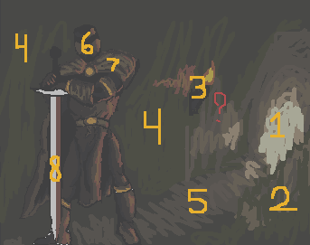 1: Opening of cave. 2: Outcropping of wall, partially concealing entrance. 3: Torch on wall. 4: Wall. 5: Floor. 6: Helmet. 7: Cape. 8: Sword. Now, assuming that those labels are correct I can actually give some advice. The big deal with the image is that the lighting from the torch doesn't make very much sense with the perspective. Judging by the angle of the floor, the torch is behind the knight and in front of the door, held onto a flat wall. Think of it in a 3d sense - the light from the torch would only hit the very edges of the warrior, on both sides, and anything concealed would be completely in shadow. There might be a little bit of firelight reflected to the front but it would only hit the very tips of things. Instead, the way it is right now makes it look like the warrior is directly to the left of the torch, ignoring the 3d perspective. Additionally, if the wall is flat, the light from the fire would extend much, much further, as well as to the outcropping I labeled 2 and the floor. However, the firelight look would only be intense close to the flame. As an example of how the light wouldn't really hit that much, I produced this image: 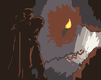 Keep in mind that any little protrusion of rock will likely have a small amount of highlight to it. Use these little protrusions and angular edges to add some visual interest to the large plane of the wall, but don't add too much or you'll distract from the focal point of the warrior. For perspective, much of the background is fine. However, the warrior is outside of the perspective. While the entire background is at an angle (and perhaps TOO much at an angle, it looks like the floor is at a forty-five degree which people would almost fall off of), the warrior's feet are on the same horizontal line, and don't make much sense. As a whole, it looks like the warrior and background were created separately and then combined. All in all, it's hard to help too much at such a rough stage. Once you actually start placing pixels it'll be much easier to help you with it. Next time though wait for a few days or some such before coming to the chat box on the front page, sometimes it takes a bit for some of the more regular critique writers to come around the forum. Oh, and judging by your typing and website that English isn't your main language (though if I'm wrong, my apologies). That's totally fine, just let me know if you need me to explain something in a different way that makes more sense to you! |
|
|
IP Logged |
|
|
Night
Commander 
Joined: 29 January 2024 Online Status: Offline Posts: 168 |
Posted: 17 July 2013 at 3:48am |
|
I think that the major issue here is the composition itself. The way I would approach it would me to make the knight slightly smaller, move him closer to the middle, and move the cave opening away from the picture's boundaries to the left. This would make the scene more balanced overall.
Furthermore, you should ask yourself questions such as "what is he doing?" "where is he going?" "who is he?" etc. It would give more meaning to the picture and something to work from on after. (for example; I don't understand why would he pose like this in a cave for no reason). Leaving that aside, the second major issue[s] is the lighting and the perspective. You should really start the whole piece with just making the basic lines of the picture for the perspective (something I didn't do with my edit), so everything would make sense afterwards, when you go to the colouring stage. And the lighting could definitely do some work. The warrior appears as if he is almost "pillow shaded", and the cave is way too well lighten, even with the torch. Speaking of the torch, Ignoring the fact that it doesn't emit any light (none that I can see), you should rethink if you even need it there at all, I suggest that if you do add a torch, then put it in one hand of the warrior, and have his sword in a scabbard, or something along those lines. I won't go into anatomy and colour, as I think I have rambled enough about the picture, but it could be improved. Here are two rough edits depicting what I meant. 

(I wouldn't suggest to use them as references at all, because I did them in a really half-arsed way, but they do convey the general idea I was heading for with my criticism.) |
|
|
IP Logged |
|
|
Juniorps
Midshipman
Joined: 06 December 2010 Online Status: Offline Posts: 91 |
Posted: 19 July 2013 at 9:56am |
|
Well my biggest doubt was what to do because I did not know what else to do before you start to refine.
@ Ego, thanks for the comments I made me to be and is observed more what I was doing and English is not really fluent in the language my parents, sorry for the mistakes in the writing. I was trying to fix by following what you said, and was ready to post up. But the comment of the Night was where I most identified my idea. @ Night Man, I could understand your comment on my work and actually even had some bizarre errors only after I realized that  haha. haha.
The question to ask the questions for my character even gave me some ideas to create a story for art. "He may be running behind a treasure, a precious stone that is a very important symbol for your people, and you need to venture into large caves" That's what I thought when I asked myself those questions. I made an edition following what you did and I hope I'm on the right track, the question of the treasure I intend to do so over time. Here it is: 
The lighter part of the front armor is where I want to do some details not to be just a darkness, what do you think? Edited by Juniorps - 19 July 2013 at 9:58am |
|
|
IP Logged |
|
|
Night
Commander
Joined: 29 January 2024 Online Status: Offline Posts: 168 |
Posted: 19 July 2013 at 12:58pm |
|
I'm glad my comment could be of help. :)
You might want to try a different composition design than that, considering that you want to emphasise is that he is running towards something, specifically a treasure. Regardless of the composition though, you should make him as someone else than a warrior dressed in full plate armour. I reckon it'd be quite hard to run in full plate armour for just some treasure, don't you agree? ;) Bah! But that's just a thought, don't follow it if you don't feel like it. Also, my edit wasn't there for you to edit over, I just wanted to show you want I meant with my criticism by that edit, not to do the work for you. You won't learn much if you take an edit that was made to help you understand something, and then draw over it and call it your own. |
|
|
IP Logged |
|
|
Juniorps
Midshipman
Joined: 06 December 2010 Online Status: Offline Posts: 91 |
Posted: 19 July 2013 at 6:47pm |

I set some ways just seems that something bothers me that the texture of the rocks are very cartoon style and theme are out of work in general. |
|
|
IP Logged |
|
| |
||
Forum Jump |
You cannot post new topics in this forum You cannot reply to topics in this forum You cannot delete your posts in this forum You cannot edit your posts in this forum You cannot create polls in this forum You cannot vote in polls in this forum |
|
