| Active TopicsSearchRegisterLogin |
| WIP (Work In Progress) | |
| |
  |
| Page of 2 Next >> |
| Author | Message |
|
Andrew-M
Commander 
Joined: 08 February 2011 Online Status: Offline Posts: 195 |
  Topic: The sunset Topic: The sunsetPosted: 04 January 2012 at 2:14pm |
|
I tried making a fisherman on a hill watching the sunset:
 If anyone sees anything i've done wrong please let me know.
|
|
 IP Logged IP Logged |
|
|
cure
Commander
Joined: 23 March 2022 Online Status: Offline Posts: 2859 |
Posted: 04 January 2012 at 2:23pm |
|
It might be more obvious he's on a hill if it sloped down at the sides rather than up. If it's just a cliff edge then no worries.
I'd recommend pushing the contrast more, since you're working with extreme sunset-lighting. the edge of the man facing the sun should have a bright highlight, his cast shadow should be rather long, etc. I think the sun should have a bright reflection in the water too, rather than the purple thing that's there now. |
|
|
IP Logged |
|
|
Andrew-M
Commander
Joined: 08 February 2011 Online Status: Offline Posts: 195 |
Posted: 04 January 2012 at 9:37pm |
|
Thanks for the help cure:
 I changed the water, changed some colors, tried to fix the hill and changed some other things.
|
|
|
IP Logged |
|
|
jalonso
Admiral 
Joined: 29 November 2022 Online Status: Offline Posts: 13537 |
Posted: 05 January 2012 at 7:20am |
|
Use colors intelligently!
You are supposed to take the knowledge from the last piece to your next. |
|
|
|
|
|
IP Logged |
|
|
Andrew-M
Commander
Joined: 08 February 2011 Online Status: Offline Posts: 195 |
Posted: 05 January 2012 at 3:58pm |
|
Sorry jalonso.
 Are these colors better?
|
|
|
IP Logged |
|
|
Trick17
Commander
Joined: 07 April 2021 Online Status: Offline Posts: 120 |
Posted: 05 January 2012 at 5:46pm |
|
I don't see any great difference. And I also would suggest to use more contrast, since it's a sunset which always makes some dark silhouettes. Google for some reference pieces.
Edited by Super17 - 05 January 2012 at 5:45pm |
|
|
IP Logged |
|
|
Andrew-M
Commander
Joined: 08 February 2011 Online Status: Offline Posts: 195 |
Posted: 05 January 2012 at 7:15pm |
|
Thanks for the help:
 I'll change this more later...
|
|
|
IP Logged |
|
|
jalonso
Admiral
Joined: 29 November 2022 Online Status: Offline Posts: 13537 |
Posted: 05 January 2012 at 7:40pm |
|
Originally posted by Andrew-M Sorry STOP THAT! I am suggesting, helping and guiding you only. You make all final decisions. This is your work not mine. Be strong and believe in yourself or you'll never make progress. ---- Look at your piece and use, change, edit colors in an intelligent way. Pictures are worlds and worlds are organic so your colors should interact in an organic manner too. Grass is green but with a golden sun you expect more blues and browns and ochers in grass. Ocean is blue but water is a reflective thing so the colors in the sky would reflect upon it and have, in this case, plenty of red and purple along with oranges and yellow in the center. The person's skin is 'skin color' but you have so little of these shades that the colors of the sky should be used here to conserve colors. The guys pants should have no unique blues. Use whatever is in the water. The browns in the hair and shoes is whatever reds and browns are reflected in the water. Shadows should be more intense and graphic. --- This time I will not make any edits to show you anything. You do it without being sorry or shy... I will only crit till you get it right  |
|
|
|
|
|
IP Logged |
|
|
Andrew-M
Commander
Joined: 08 February 2011 Online Status: Offline Posts: 195 |
Posted: 06 January 2012 at 12:19am |
|
Thanks for the help jalonso:
 This may be a dumb question but should things have less contrast the farther away they are? Edited by Andrew-M - 06 January 2012 at 12:59am |
|
|
IP Logged |
|
|
jalonso
Admiral
Joined: 29 November 2022 Online Status: Offline Posts: 13537 |
Posted: 06 January 2012 at 7:03am |
|
Originally posted by Andrew-M Thanks for the help jalonso:
This may be a dumb question but should things have less contrast the farther away they are? It depends on the piece. Generally less contrast and less detail is the rule. What is the brown thing? The green colors seem off now with these new colors. Bring them closer to purples or desaturate the green ramp a bit. What is the green/brown area? Is it sand? If it is sand then this is a bad fishing spot as the water would be shallow. It can be sand if you add a pier where that brown thing is. The sun's reflection should have no angle or perspective. Water just reflect down. The arms are messy, thick and over pixelled. Simplify and clean them up. The pixelling on the water is too straight and perfect. Water is fluid so either add fluidity by pixelling areas using the farther back less contrast/detail or very little pixelling and depend on the reflection of the sun only. Sky will eventually need more work so it reads as a glow. |
|
|
|
|
|
IP Logged |
|
|
Andrew-M
Commander
Joined: 08 February 2011 Online Status: Offline Posts: 195 |
Posted: 06 January 2012 at 7:13pm |
|
It's supposed to be a boat. I thought it looked good ):
 Edited by Andrew-M - 06 January 2012 at 7:44pm |
|
|
IP Logged |
|
|
mdog95
Commander
Joined: 14 December 2017 Online Status: Offline Posts: 150 |
Posted: 06 January 2012 at 8:27pm |
|
Now you've changed the sand to grass. It wouldn't make any sense for there to be grass on a beach, would it?
Try reusing the last color in that area as the base and pixel some grainy texture by a little bit of dithering with the new color and maybe a highlight color, but DO NOT go overboard with the dithering. Heavy dithering never looks good in a nature piece, in my opinion. |
|
|
IP Logged |
|
|
Andrew-M
Commander
Joined: 08 February 2011 Online Status: Offline Posts: 195 |
Posted: 06 January 2012 at 9:09pm |
|
Originally posted by jalonso
I might have misunderstood what jalonso meant but that's why I changed it to grass...
What is the green/brown area? Is it sand? If it is sand then this is a bad fishing spot as the water would be shallow. Edit:I changed some colors:
 Edit2:I removed a color and changed things:
 I'm not sure this is good though, I think there might be too much red and brown now...
Edited by Andrew-M - 07 January 2012 at 8:37pm |
|
|
IP Logged |
|
|
Andrew-M
Commander
Joined: 08 February 2011 Online Status: Offline Posts: 195 |
Posted: 08 January 2012 at 5:18pm |
|
I changed the water:
 |
|
|
IP Logged |
|
|
unimportant
Seaman 
Joined: 29 April 2025 Online Status: Offline Posts: 11 |
Posted: 08 January 2012 at 5:42pm |
|
I'm not sure if my advice would be of any help because I'm a noob at pixeling things, I come from traditional art but I'm unsure if my advice would be useful in this case...
I feel your picture is lacking some contrasting light, I mean, even the sun is kinda dark... if you added highlights in the water and around the guy I think it would work way better... here's what I mean with that... http://img854.imageshack.us/img854/6935/lutari.jpg the picture is really old, but I think it shows what I'm trying to say, of course if this advice is actually terrible, please someone correct me. Edited by unimportant - 08 January 2012 at 5:42pm |
|
|
IP Logged |
|
|
cure
Commander
Joined: 23 March 2022 Online Status: Offline Posts: 2859 |
Posted: 08 January 2012 at 6:56pm |
 I agree with the above post. Needs some light introduced. anatomy is kinda funky. shoulders too narrow for those bulky arms, there is no clean transition between deltoid/trapezious/neck, it's just a box under the head. neck is missing. feet are a bit bulky as well. Can't tell what he's holding on the left, fishing rod could be held more naturally (typically one holds it in fron of them, rather than straight out to the side) and could be a tad thinner. hair goes too far foreward and would be covering the forehead. |
|
|
IP Logged |
|
|
Manupix
Commander
Joined: 07 May 2026 Online Status: Offline Posts: 771 |
Posted: 08 January 2012 at 7:22pm |
|
I'd recommend adding some hint that he's on a cliff top. It would make the piece more readable, as well as provide some visual impact. Something like this, or that.
The boat perspective is off. From this distance and height (distance being probably around 10x height) you'd have less angle and more foreshortening. There should be better refs than this. I'd also go further than cure and remove all grass on the beach level. Generally your art would benefit from a widespread use of references. And even more from sketching stuff from life! You may not live near a seaside cliff, but sketching cars from a 10 story-building is just as good =) Originally posted by unimportant I come from traditional art but I'm unsure if my advice would be useful in this case... You joking right? That's exactly why your advice is solid ;) The basic art skills are just the same, and any experience in one field can only be beneficial to the others. Edited by Manupix - 08 January 2012 at 7:23pm |
|
|
IP Logged |
|
|
Andrew-M
Commander
Joined: 08 February 2011 Online Status: Offline Posts: 195 |
Posted: 09 January 2012 at 4:12pm |
|
Thank you all for the help. Does the anatomy look better?
 I'll change the other things soon(since there's so many things to change I thought it would be best to change one thing at a time).
Unimportant, don't worry that was good advice (:
Cure, he's supposed to be holding fish. I'm going to try making them again and hopefully they'll look better.
Manupix, i'm going to try using references more.
|
|
|
IP Logged |
|
|
mdog95
Commander
Joined: 14 December 2017 Online Status: Offline Posts: 150 |
Posted: 09 January 2012 at 7:08pm |
|
Originally posted by mdog95
Now you've changed the sand to grass. It wouldn't make any sense for there to be grass on a beach, would it? Try reusing the last color in that area as the base and pixel some grainy texture by a little bit of dithering with the new color and maybe a highlight color, but DO NOT go overboard with the dithering. Heavy dithering never looks good in a nature piece, in my opinion. No, and you completely ignored my suggestion. The anatomy looks exactly the same. Just make it as similar as possible to the edit. |
|
|
IP Logged |
|
|
Andrew-M
Commander
Joined: 08 February 2011 Online Status: Offline Posts: 195 |
Posted: 09 January 2012 at 10:28pm |
|
Thanks for the help mdog95:
 I started making the sand and the sun.
Instead of changing one thing at a time i'm going to try doing everything at once. It will probably take a couple days, I have so much to change  Edited by Andrew-M - 09 January 2012 at 10:27pm |
|
|
IP Logged |
|
|
Manupix
Commander
Joined: 07 May 2026 Online Status: Offline Posts: 771 |
Posted: 10 January 2012 at 5:41pm |
|
Originally posted by Andrew-M Instead of changing one thing at a time i'm going to try doing everything at once. If this means start again from scratch, then yes! You have been stuck from the start by the consequences of wrong early choices in composition, perspective etc. At some point trying to change a piece is more time-consuming (and has a lesser chance of success) than scrapping it. This does not mean that you're back to zero btw, you learned something and you will make a better start thanks to it. I'd also strongly recommend doodling on paper first (if you don't already), you can easily and quickly try composition options. Upload those if you want opinions! They're not supposed to be nice, ok? Just working stages. Edited by Manupix - 10 January 2012 at 5:42pm |
|
|
IP Logged |
|
|
Andrew-M
Commander
Joined: 08 February 2011 Online Status: Offline Posts: 195 |
Posted: 11 January 2012 at 12:03am |
|
I meant I was going to keep working on it but starting over seems like a better idea so i'll do that instead...
Would something like this be good?
 Edited by Andrew-M - 11 January 2012 at 12:06am |
|
|
IP Logged |
|
|
ingl0rius
Midshipman 
Joined: 25 June 2015 Online Status: Offline Posts: 45 |
Posted: 11 January 2012 at 5:05am |
|
Originally posted by Andrew-M
I meant I was going to keep working on it but starting over seems like a better idea so i'll do that instead...
Would something like this be good?
I think that looks better - His arm seems a bit thick though in my opinion. |
|
|
IP Logged |
|
|
Manupix
Commander
Joined: 07 May 2026 Online Status: Offline Posts: 771 |
Posted: 11 January 2012 at 10:31am |
|
Definitely a better composition.
The sun is huuuuge, you only see it that big in a telescope. Of course it could be a deliberate choice, but I don't think it brings anything to the concept or image. A realistic size would be just a few pixels wide, with a large highlight area around. Look at refs! |
|
|
IP Logged |
|
|
Andrew-M
Commander
Joined: 08 February 2011 Online Status: Offline Posts: 195 |
Posted: 11 January 2012 at 7:00pm |
|
Thanks for the help ingl0rius and Manupix, I changed the arm and the sun and started shading and adding colors:
 I used a couple references. Also I know most of the colors are bad, i'll change them soon...
|
|
|
IP Logged |
|
|
jeremy
Rear Admiral 
Joined: 25 November 2024 Location: New Zealand Online Status: Offline Posts: 1704 |
Posted: 11 January 2012 at 7:19pm |
|
Not a fan of the sky gradient, and the neck+arms would be shaded to black in the middle as well.
|
|
|
IP Logged |
|
|
Andrew-M
Commander
Joined: 08 February 2011 Online Status: Offline Posts: 195 |
Posted: 12 January 2012 at 8:37pm |
|
Thanks for the help Jeremy:
 I couldn't get the black on the skin to look good. Would something like this work? Also i'm not sure if I fixed the sun.
|
|
|
IP Logged |
|
|
LordGeneral
Seaman
Joined: 12 January 2012 Online Status: Offline Posts: 7 |
Posted: 12 January 2012 at 8:46pm |
|
I'm impressed by the level of input from the community and the effort put in by you Andrew! Nice work. I hope you get the end result your looking for. Sure looks like you are learning a bunch!
|
|
|
IP Logged |
|
|
unimportant
Seaman
Joined: 29 April 2025 Online Status: Offline Posts: 11 |
Posted: 12 January 2012 at 9:27pm |
|
It's already better, the composition works better and I like that you changed the colors of the sea and sky, it looks more like a sunset now, I still think you need a more dramatic lightning in the character, like the edit Cure made.
I think the color of the strong shadows should be toned down, like the one previous to the last one (I don't know how to say it, sorry, english is not my first language) because in your last pic, the shadows look like a huge block and make the picture look weird. That's it, you're making progress :D |
|
|
IP Logged |
|
|
Andrew-M
Commander
Joined: 08 February 2011 Online Status: Offline Posts: 195 |
Posted: 13 January 2012 at 8:09pm |
|
Thanks LordGeneral (:
Thanks for the help unimportant, I hope I did this right:
 |
|
|
IP Logged |
|
|
Andrew-M
Commander
Joined: 08 February 2011 Online Status: Offline Posts: 195 |
Posted: 14 January 2012 at 6:14pm |

|
|
|
IP Logged |
|
|
Andrew-M
Commander
Joined: 08 February 2011 Online Status: Offline Posts: 195 |
Posted: 16 January 2012 at 3:08pm |
|
I changed some colors and a couple other things:

|
|
|
IP Logged |
|
|
Manupix
Commander
Joined: 07 May 2026 Online Status: Offline Posts: 771 |
Posted: 16 January 2012 at 3:18pm |
|
You might widen the image vertically, you will want to use a little more space for both sky and foreground.
The main interest of this picture is going to be light and color, so better start with good options there ;) There are many types of sunsets, the most interesting ones involve differences of color between sky and sea, gradients, etc. The sea is often bluer than the sky because the slope of the waves facing the observer makes them reflect bluer sky, farther up than perfectly still water would reflect. The direct sun reflections make a redder path in this bluish grey and it's gorgeous! Haze on the horizon can appear grey or purple. Refs, again. 1, 2, 3, 4. Foreground: the light hitting the guy's back will be partly blue. The light on the grass will be either red or blue or both, according to which way it faces. Look at the man's back, and the tree at bottom left. Never assume grass is green! Think as of now at what you mall make the beach look like as it will impact your composition. Wet and shiny as in some of those refs? Dry and dark? Surfy and catching the sun? Edited by Manupix - 16 January 2012 at 3:20pm |
|
|
IP Logged |
|
|
Andrew-M
Commander
Joined: 08 February 2011 Online Status: Offline Posts: 195 |
Posted: 19 January 2012 at 4:14pm |
|
I've tried a few times making the colors like in your references but each time I try it looks even worse. I'll keep trying, it will probably take a while though...
|
|
|
IP Logged |
|
|
Andrew-M
Commander
Joined: 08 February 2011 Online Status: Offline Posts: 195 |
Posted: 22 January 2012 at 4:10pm |
|
This is my least terrible attempt:
 I've only changed the colors and the guy, i'll change the other things later.
|
|
|
IP Logged |
|
|
cure
Commander
Joined: 23 March 2022 Online Status: Offline Posts: 2859 |
Posted: 22 January 2012 at 4:33pm |
|
the colors look a thousand times better, kutgw sun is still massive, but you're probably aware. arm seems really thick compared to the torso, I'd reduce its width by a pixel or two and increase the torso's width by a pixel or two.
|
|
|
IP Logged |
|
|
Andrew-M
Commander
Joined: 08 February 2011 Online Status: Offline Posts: 195 |
Posted: 24 January 2012 at 4:19pm |
|
Thanks for the help cure:
 Is just the sun big or the things around it as well?
|
|
|
IP Logged |
|
|
PixelSnader
Commander
Not a troll! Joined: 21 May 2026 Online Status: Offline Posts: 3194 |
Posted: 24 January 2012 at 4:38pm |
|
I'd go for a clearer defined sun.
Have a fairly harsh sun-sky transition, and then a very smooth fade to the sides. |
|
|
▄▄█ ▄▄█ ▄█▄ ▄█▄ |
|
|
IP Logged |
|
|
Andrew-M
Commander
Joined: 08 February 2011 Online Status: Offline Posts: 195 |
Posted: 26 January 2012 at 7:48pm |
|
Thanks for the help snader:
 Originally posted by snader Have a fairly harsh sun-sky transition, and then a very smooth fade to the sides. I'm honestly not sure what this means though...
|
|
|
IP Logged |
|
|
cure
Commander
Joined: 23 March 2022 Online Status: Offline Posts: 2859 |
Posted: 26 January 2012 at 11:28pm |
|
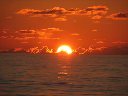
right now the sun blends smoothly into the sky. snader is saying to keep the gradient in the sky smooth (or smoother), and to make the sun contrast more with the sky around it. think about when you actually look at the sun. it's a brilliant white circle, clearly separate from the sky around it (as in the photo he provided)
|
|
|
IP Logged |
|
|
Andrew-M
Commander
Joined: 08 February 2011 Online Status: Offline Posts: 195 |
Posted: 27 January 2012 at 4:09pm |
|
Thanks for explaining cure, I hope I did this right:
 |
|
|
IP Logged |
|
|
Friend
Commander
Joined: 01 April 2015 Online Status: Offline Posts: 710 |
Posted: 27 January 2012 at 4:24pm |
|
I think the sun is too wide. The lighting on the man makes it look as if a red or orange sun is on the horizon, but yours is like an off white peach color. Are you going to give texture to the sky and water?
|
|
|
IP Logged |
|
|
Andrew-M
Commander
Joined: 08 February 2011 Online Status: Offline Posts: 195 |
Posted: 27 January 2012 at 8:34pm |
|
Thanks for the help Frost Butt:
 I made the sun smaller. I tried making the sun more red but it didn't look as bright and I thought it looked bad...
I probably wont give texture to the sky or water unless anyone thinks I should.
|
|
|
IP Logged |
|
|
Andrew-M
Commander
Joined: 08 February 2011 Online Status: Offline Posts: 195 |
Posted: 29 January 2012 at 4:10pm |
|
Is there anything else I should change? I think this might be done.
|
|
|
IP Logged |
|
|
crozier
Commander
Joined: 08 May 2023 Online Status: Offline Posts: 190 |
Posted: 29 January 2012 at 6:33pm |
|
Water texture pehaps? And have the end of the wave more wave-y?
And Im kinda sure the shadow on the rock hes sitting on is incorrect. Also if you google "ocean sunset" the results show that there is a somewhat thin layer of darker water, at the point where the water touches the sky. And there wouldn't be a thin bright portion of the water where it touches the sand. If anything, it would be slightly darker because you would see through the water and see the darker sand.
|
|
|
IP Logged |
|
|
Andrew-M
Commander
Joined: 08 February 2011 Online Status: Offline Posts: 195 |
Posted: 30 January 2012 at 5:42pm |
|
Thanks for the help crozier:
 Originally posted by crozier And there wouldn't be a thin bright portion of the water where it touches the sand. If anything, it would be slightly darker because you would see through the water and see the darker sand. |
|
|
IP Logged |
|
|
mdog95
Commander
Joined: 14 December 2017 Online Status: Offline Posts: 150 |
Posted: 30 January 2012 at 9:04pm |
|
That's because they were breaking waves.
The problem I see here is the sunset isn't dominant as the light source. It's just kind of there. Here is a quick edit. Sorry about the bottom left corner.. GIMP just kind of... does that... with pasted images... 
The sand wasn't textured enough, IMO, and, as stated earlier, the sun just didn't take its place as a sun setting over the ocean. There was also a major lack of AA. I hope this gets across what I'm trying to say.. EDIT: I was being kind of a hypocrite saying you didn't AA and then not AA myself =P  Edited by mdog95 - 30 January 2012 at 9:09pm |
|
|
IP Logged |
|
|
jeremy
Rear Admiral
Joined: 25 November 2024 Location: New Zealand Online Status: Offline Posts: 1704 |
Posted: 30 January 2012 at 9:43pm |
|
Here's an edit, scribblyness kinda makes the reflection seem like it's sticking out. Added a few more colours, could
All your colours are on the red-purple side, but yellow and purple work great together. I'd even prefer this sort of hue as the sky's base colour.  |
|
|
IP Logged |
|
|
PixelSnader
Commander
Not a troll! Joined: 21 May 2026 Online Status: Offline Posts: 3194 |
Posted: 30 January 2012 at 10:24pm |
|
Jeremy's edit is spot on with what I meant. (and with other things too)
|
|
|
▄▄█ ▄▄█ ▄█▄ ▄█▄ |
|
|
IP Logged |
|
|
mdog95
Commander
Joined: 14 December 2017 Online Status: Offline Posts: 150 |
Posted: 30 January 2012 at 10:37pm |
|
It is.
|
|
|
IP Logged |
|
| Page of 2 Next >> |
| |
||
Forum Jump |
You cannot post new topics in this forum You cannot reply to topics in this forum You cannot delete your posts in this forum You cannot edit your posts in this forum You cannot create polls in this forum You cannot vote in polls in this forum |
|
