| Active TopicsSearchRegisterLogin |
| Collaborations/Challenges | |
| |
  |
| Page of 2 Next >> |
| Author | Message |
|
administrator
Admiral 
Joined: 03 March 2005 Online Status: Offline Posts: 0 |
  Topic: CHALLENGE 9/10/2012: Angels and Demons Topic: CHALLENGE 9/10/2012: Angels and DemonsPosted: 10 September 2012 at 12:00am |
CHALLENGE: Angels and DemonsPixel a sprite of either an angel or a demon. If you pick angel, you must include this colour:  If you pick demon, you must include this colour:
CHALLENGE RULES
CHALLENGE JUDGING
CHALLENGE PRIZES/GOODIES
CHALLENGE VOTINGVote now for your favorite pixelart in this week's challenge!CHALLENGE VOTINGVote now for your favorite pixelart in this week's challenge!CHALLENGE AWARDSThe Angels and Demons pixel art challenge is complete and we have three new champions. This week's challenge awards go to the following pieces:Thanks so much to all who took the time to vote and participate in the challenge! Devil's Jeans by Qbi CHALLENGE AWARDSThe Angels and Demons pixel art challenge is complete and we have three new champions. This week's challenge awards go to the following pieces:Thanks so much to all who took the time to vote and participate in the challenge! Devil's Jeans by Qbi
|
|
 IP Logged IP Logged |
|
|
Stronghold257
Seaman 
Joined: 08 July 2021 Online Status: Offline Posts: 33 |
Posted: 10 September 2012 at 6:15am |
|
Hmm... Can we create a mix of both of them?
|
|
|
IP Logged |
|
|
jalonso
Admiral
Joined: 29 November 2022 Online Status: Offline Posts: 13537 |
Posted: 10 September 2012 at 6:43am |
|
Originally posted by Stronghold257 Hmm... Can we create a mix of both of them? It's best not to ;) |
|
|
|
|
|
IP Logged |
|
|
cirpons
Seaman
Joined: 01 June 2019 Online Status: Offline Posts: 14 |
Posted: 10 September 2012 at 8:05am |
|
Well, it does say EITHER meaning only one of the two.
I started making a portrait of the devil and just realized it has to be a sprite.*facepalm* |
|
|
IP Logged |
|
|
SirRevi
Seaman
Joined: 01 September 2012 Online Status: Offline Posts: 1 |
Posted: 10 September 2012 at 8:50am |
|
Originally posted by cirpons Haha I did the exact same thing. Except I actually finished it and THEN read the rules again...Well, it does say EITHER meaning only one of the two. I started making a portrait of the devil and just realized it has to be a sprite.*facepalm* |
|
|
IP Logged |
|
|
Gunster
Seaman
Joined: 14 August 2012 Online Status: Offline Posts: 15 |
Posted: 10 September 2012 at 9:13am |
|
Does it have to be the classic angel with wings and demon with horns or can we do our own choices on shape etc?
|
|
|
IP Logged |
|
|
cirpons
Seaman
Joined: 01 June 2019 Online Status: Offline Posts: 14 |
Posted: 10 September 2012 at 9:34am |
|
Originally posted by Gunster Does it have to be the classic angel with wings and demon with horns or can we do our own choices on shape etc? It has to be a demon or an angel, you can interpret those however you like tho (Just make sure other people could recognize it). |
|
|
IP Logged |
|
|
Terrify
Seaman
Joined: 15 January 2012 Online Status: Offline Posts: 11 |
Posted: 10 September 2012 at 9:49am |
|
Wooh I like this challenge idea.
|
|
|
IP Logged |
|
|
MrBeast
Midshipman 
Joined: 08 March 2022 Online Status: Offline Posts: 17 |
Posted: 10 September 2012 at 11:30am |

|
|
|
IP Logged |
|
|
Cheetah
Midshipman
Joined: 20 March 2009 Online Status: Offline Posts: 48 |
Posted: 10 September 2012 at 1:24pm |
|
IP Logged |
|
|
tomic
Midshipman
Joined: 21 July 2020 Online Status: Offline Posts: 93 |
Posted: 10 September 2012 at 2:32pm |
|
doodling around..
devilish angel  (censored version) "slightly" over the canvas + i still don't have time for weeklies.. just delivering inspirations :) Edited by tomic - 10 September 2012 at 2:33pm |
|
|
pixel suit up!
|
|
|
IP Logged |
|
|
Cheetah
Midshipman
Joined: 20 March 2009 Online Status: Offline Posts: 48 |
Posted: 10 September 2012 at 6:09pm |
|
I could really use some advice on shading, specifically the face and the outstretched leg. Oceanscented's colors have been awesome to use.

|
|
|
IP Logged |
|
|
MrBeast
Midshipman
Joined: 08 March 2022 Online Status: Offline Posts: 17 |
Posted: 10 September 2012 at 7:30pm |

Edit: Demon quicky  Edited by MrBeast - 10 September 2012 at 9:47pm |
|
|
IP Logged |
|
|
Cheetah
Midshipman
Joined: 20 March 2009 Online Status: Offline Posts: 48 |
Posted: 10 September 2012 at 10:49pm |
|
Added some horns, for more demon, and trying out a bit of animation.

MrBeast: Loving the halo on the Angel, and good use of the blue on the Demon. Edited by Cheetah - 10 September 2012 at 10:50pm |
|
|
IP Logged |
|
|
RileyFiery
Midshipman
Joined: 11 October 2020 Online Status: Offline Posts: 78 |
Posted: 11 September 2012 at 3:37am |
|
You can draw Lucifer with the angel colors right?
|
|
|
IP Logged |
|
|
Gunster
Seaman
Joined: 14 August 2012 Online Status: Offline Posts: 15 |
Posted: 11 September 2012 at 7:40am |
|
Was aiming for something cartoony but damn, some of the WIP's up there just made me think of redoing.
|
|
|
IP Logged |
|
|
-
Seaman
Joined: 04 December 2024 Online Status: Offline Posts: 1 |
Posted: 11 September 2012 at 8:33am |
|
Very, very, very early draft of my demon
 > >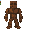 > > > > > > > > Edited by TheMonsterAtlas - 11 September 2012 at 1:38pm |
|
|
IP Logged |
|
|
Zeratanus
Commander 
Joined: 03 December 2020 Online Status: Offline Posts: 576 |
Posted: 11 September 2012 at 10:27am |
|
A spriting challenge? While my workload is down? Count me in :)
this is what I've managed to get during breaks at work so far. I'm still one color short (that green is a placeholder and not in the sprite itself), so if anyone could suggest a good use for that color slot I'd be more than happy :D Still need to re-add the halo I took out earlier. Also thinking of animating it if I get the time~ edit: and another! Now with animation:  > >  > > > >
(nothing in the challenge says the red color has to be prominent so what I've got so far is fine right? Just want to be sure) Edited by Zeratanus - 11 September 2012 at 2:14pm |
|
|
IP Logged |
|
|
Dont
Midshipman
Joined: 09 February 2022 Online Status: Offline Posts: 45 |
Posted: 11 September 2012 at 11:32am |
|
IDK WHY my brain love this weird positions
so sorey 
|
|
|
IP Logged |
|
|
scallhero
Seaman
Joined: 28 August 2012 Online Status: Offline Posts: 3 |
Posted: 11 September 2012 at 11:43am |
|
Not sure which one to go with
This I guess is a blood angel 
And this is an ice demon being ridden by an orc bannerman. 
|
|
|
IP Logged |
|
|
Yuran
Commander
Joined: 10 November 2024 Online Status: Offline Posts: 329 |
Posted: 11 September 2012 at 12:02pm |
|
first lines (oh, and I will suffer with her little face ...)

|
|
|
IP Logged |
|
|
Cheetah
Midshipman
Joined: 20 March 2009 Online Status: Offline Posts: 48 |
Posted: 11 September 2012 at 8:49pm |
|
Any thoughts on how I could get more blue in here? Right now I just have the two pixels for the eyes.

@Scallhero: Can't you submit multiple entries? Edited by Cheetah - 11 September 2012 at 8:51pm |
|
|
IP Logged |
|
|
_Connor
Seaman
Joined: 30 May 2015 Online Status: Offline Posts: 8 |
Posted: 11 September 2012 at 9:23pm |
|
runes/tattoos on his arms/body. Maybe glowing? Maybe make his eyes glow?
Give him a weapon? Was it inspired by A titanite demon by any chance? http://darksoulswiki.wikispaces.com/file/view/titanite_demon.jpg/256916476/titanite_demon.jpg Looks slightly similar, or maybe it's just the pose. |
|
|
IP Logged |
|
|
FUNBAG-GAMES
Seaman
Joined: 08 August 2012 Online Status: Offline Posts: 8 |
Posted: 12 September 2012 at 2:25am |
|
I really like this, the pose is cool and the palette works. I actually preferred it without the horns. I think they take something away from the excellent posture the character has. Maybe the horn shape is too similar to one of the frames of the tail anim. you could try making them smaller maybe.
good stuff |
|
|
IP Logged |
|
|
FUNBAG-GAMES
Seaman
Joined: 08 August 2012 Online Status: Offline Posts: 8 |
Posted: 12 September 2012 at 2:31am |
|
Originally posted by Zeratanus
A spriting challenge? While my workload is down? Count me in :) this is what I've managed to get during breaks at work so far. I'm still one color short (that green is a placeholder and not in the sprite itself), so if anyone could suggest a good use for that color slot I'd be more than happy :D Still need to re-add the halo I took out earlier. Also thinking of animating it if I get the time~ edit: and another! Now with animation: > >>
(nothing in the challenge says the red color has to be prominent so what I've got so far is fine right? Just want to be sure) I think you need to offset the flapping with the rise and fall. If the hair flap is keeping this character floating as the character rises the hair should come down. also maybe stick one more frame or change a current one so the end of the hair is more upturned just before it comes down. good work tho. |
|
|
IP Logged |
|
|
Zeratanus
Commander
Joined: 03 December 2020 Online Status: Offline Posts: 576 |
Posted: 12 September 2012 at 7:13am |
|
Ah man thanks! It looks so obviously wrong now that you mention it!
Alright, got it edited, and with more frames, though it doesnt have any additional more upturned falling frame yet. Added a shadow too. -> 
|
|
|
IP Logged |
|
|
cirpons
Seaman
Joined: 01 June 2019 Online Status: Offline Posts: 14 |
Posted: 12 September 2012 at 8:34am |
|
Originally posted by Zeratanus Ah man thanks! It looks so obviously wrong now that you mention it! Alright, got it edited, and with more frames, though it doesnt have any additional more upturned falling frame yet. Added a shadow too. -> I know who gets my vote :D. Not a fan of the shadow tho, since it cuts off at the end, maybe make the spear shorter and the shadows a bit higher? |
|
|
IP Logged |
|
|
FUNBAG-GAMES
Seaman
Joined: 08 August 2012 Online Status: Offline Posts: 8 |
Posted: 12 September 2012 at 8:53am |
|
Originally posted by Zeratanus
Ah man thanks! It looks so obviously wrong now that you mention it! Alright, got it edited, and with more frames, though it doesnt have any additional more upturned falling frame yet. Added a shadow too. -> yes better, I really dont think will need to add another frame, like I say just edit one thats already in there as It already spends a fair bit of time in that area (straight out) good luck :) |
|
|
IP Logged |
|
|
Zeratanus
Commander
Joined: 03 December 2020 Online Status: Offline Posts: 576 |
Posted: 12 September 2012 at 10:42am |
|
Thanks folks :D here's the fruits of it so far.
added the higher wing position, and animated the skirt a little, and added another line to the shadow (I assume that's what you meant by it cutting off, Cirpons? turns out i have another 3 pixels or so hight wise i can play with) also started block and attack poses for the fun of it. if I get around to animating them this could end up one of my most complex pieces yet > and - and - 
edit: I dont really want to hog up this whole thread since I update so much. Check out my thread in the WIP forums here! Edited by Zeratanus - 12 September 2012 at 2:24pm |
|
|
IP Logged |
|
|
cirpons
Seaman
Joined: 01 June 2019 Online Status: Offline Posts: 14 |
Posted: 12 September 2012 at 12:12pm |
|
Originally posted by Zeratanus Thanks folks :D here's the fruits of it so far. added the higher wing position, and animated the skirt a little, and added another line to the shadow (I assume that's what you meant by it cutting off, Cirpons? turns out i have another 3 pixels or so hight wise i can play with) also started block and attack poses for the fun of it. if I get around to animating them this could end up one of my most complex pieces yet > and - Yes that was what i meant. Cute block pose :3. |
|
|
IP Logged |
|
|
SJL
Seaman
Joined: 22 May 2012 Online Status: Offline Posts: 27 |
Posted: 12 September 2012 at 2:59pm |
|
Originally posted by Zeratanus
Thanks folks :D here's the fruits of it so far. added the higher wing position, and animated the skirt a little, and added another line to the shadow (I assume that's what you meant by it cutting off, Cirpons? turns out i have another 3 pixels or so hight wise i can play with) also started block and attack poses for the fun of it. if I get around to animating them this could end up one of my most complex pieces yet > and -
edit: I dont really want to hog up this whole thread since I update so much. Check out my thread in the WIP forums here! I like it. Just a technical thing but assuming your light source is the sun, or something from above, the shadow should get larger the higher the angel goes. When she gets closer to the ground, she doesn't block as much light, making the shadow smaller and more precise. Aside from my silly nitpicking, I think it's turning out well, and I'm hoping you do get around to animating the block pose |
|
|
IP Logged |
|
|
Zeratanus
Commander
Joined: 03 December 2020 Online Status: Offline Posts: 576 |
Posted: 12 September 2012 at 3:16pm |
 well, if I have the time I'll see what I can do about the shadows if I have time, but I'll put more animation in before nitpicking like that, heheh. but thanks! well, if I have the time I'll see what I can do about the shadows if I have time, but I'll put more animation in before nitpicking like that, heheh. but thanks!I've started the block animation, but I've moved to a WIP forum topic so I dont completely spam the hell out of this one. http://www.pixeljoint.com/forum/forum_posts.asp?TID=15072 |
|
|
IP Logged |
|
|
Cheetah
Midshipman
Joined: 20 March 2009 Online Status: Offline Posts: 48 |
Posted: 12 September 2012 at 3:59pm |
|
@Conner: I didn't draw design inspiration from that, though there are similarities. I wish I could find a way to make the eyes more glowing and prominent. I fear that a weapon might detract from the pose, runes might work though.
@Funbag: I will try making the horns smaller, or maybe making one broken off. Thanks for the advice! Update: Breathing and smaller horns. I'm still having trouble with getting more blue in there.  Edited by Cheetah - 12 September 2012 at 8:36pm |
|
|
IP Logged |
|
|
tuaarita
Commander
Joined: 04 December 2015 Online Status: Offline Posts: 1049 |
Posted: 13 September 2012 at 4:50am |
|
CANVAS! Y U SO TINY?!

|
|
|
I'm running in the desert,
running in to the sun, running out of blood and I'm going numb. |
|
|
IP Logged |
|
|
Elastico-Gadget
Midshipman
Joined: 04 September 2019 Online Status: Offline Posts: 59 |
Posted: 13 September 2012 at 7:00am |
|
Hi everyone, I'd be really glad to get some advice on this piece I am making for the weekly challenge :
 x2 :  I am actually struggling with the legs-ankles-feet part. Last edit : Edited by Elastico-Gadget - 13 September 2012 at 8:00am |
|
|
IP Logged |
|
|
Zeratanus
Commander
Joined: 03 December 2020 Online Status: Offline Posts: 576 |
Posted: 13 September 2012 at 8:19am |
|
Here's a few edits I thought of. Most of them are done on the left side of the sprite. Didnt bother editing both sides.
- right now the clothe kind of reads like a diaper de to its thickness on the sides. I thinned it out a bit, and added more of a shadow that the leg would cast onto it, to give it a better sense of depth (shadow is really just slopped on there though, noting precise) - reshaped the foot, ankle, and lower leg slightly, to give the lower leg muscles a bit more shape, and some shape to the bottom of the feet. - Added shadows on the left hand. The fingers would be blocking a lot of light to it, and it helps give a sense of depth (like with the clothe) - Edited the colors a bit, just adding some saturation to the oranges, and toned down the (non-challenge) blues, so they blend together a bit better - some quick minor edits to the face shading hope it helps :) |
|
|
IP Logged |
|
|
Elastico-Gadget
Midshipman
Joined: 04 September 2019 Online Status: Offline Posts: 59 |
Posted: 13 September 2012 at 8:31am |
|
Thank you very much for taking the time to help !
 This is really helpful. This is really helpful. |
|
|
IP Logged |
|
|
arkoso
Seaman
Joined: 13 September 2012 Online Status: Offline Posts: 3 |
Posted: 13 September 2012 at 8:55am |
|
Hello everyone,
First post here, and also my very first attempt at pixel art! I felt inspired by some of the art on this website, and figured I would give the challenge a go.  I have been an artistic of realism for many years, so this is something very very new for me! I guess for the challenge I was inspired by two things: a FF Mage, which I had in my head as I was drawing the angel, and also the submission as shown by Zeratanus (which I absolutely love by the way!!). I examined that in a bit of detail to get a bit of an idea as to the form of a character for something like this. The comparisons are obvious I think. Now here it is: Without any effect:  With a bit of added radiant lighting:  As this is my first attempt, I am more conscious than you can probably imagine as to its flaws. For one, I thing the wing on our left could be bigger and a bit more dimensional. The effect itself is rather cheesy - that is why I uploaded them both. An opinion would be great on that. The colour scheme is also a bit wacky - being a pencil artist I draw purely in B&W - so any help there is also appreciated! In general I think the perspective is also way off ... but I guess that just comes with practice. Something I noticed just whilst writing this - it could definitely be a bit bigger as well. I guess her staff is a little restrictive on this, but it could surely be changed. At least I followed all the rules of the challenge! I would love to hear peoples suggestions and critique on this 100% W.I.P.! |
|
|
IP Logged |
|
|
Zeratanus
Commander
Joined: 03 December 2020 Online Status: Offline Posts: 576 |
Posted: 13 September 2012 at 10:17am |
 heheh, flattery will get you everywhere! (Honestly though, I'm happy I could inspire someone!) heheh, flattery will get you everywhere! (Honestly though, I'm happy I could inspire someone!)
For a first attempt, this is really pretty good. I've done some edits to try and help. (Edits were done on the first version, just for my own ease :P) > 
- First and most importantly, in pixel art readability is key. Two things that can really get in the way of this - color choice and over-detailing. Pixel art really is the art of "less is more". You want to only use as much detail and as much color as you need to convey your idea. Mostly in this piece, the dark detailed shading muddies it up. In my edit I've vastly reduced the amount of that purple shading. it's not so much amount of detail as it is the great contrast between the purple and the pink/blue, and then the lack of contrast against the red. It works on the clothing and as a shadow, but on the hair and wings its just too much. At first, I didnt think I could get the pink to work at all, but replacing the purple shading with the orange, it actually works quite nicely. I also added some highlight using the skin color. In fact, the only color I changed was the lightest - it was very similar to the other skin tone, so I just bumped up its brightness some more to make it more unique. - The shield I changed to red for two reasons - 1: the shield would be in shadow (except for some light from the staff in the 2nd version) and that blue just isnt dark enough, and 2: the cross just wasnt visible on the blue (also adjusted the shape of the cross to match the angle) - I also moved around some bits - the chest and waist are higher, making the legs longer and more in proportion. Also moved around parts of the dress to match the angle. The details between the flaps of the dress I just covered in shadow, but that could be one of those details you wouldnt want removed. - few other things to note: in version two, if the staff is giving off light, it probably wouldnt cast much if any of a shadow (not very experienced with that kind of advanced lighting stuff so I'm not actually sure), and the shadow of the staff changed widths quite a bit down the line of it, when it seems all level, so it should remain pretty consistent. That may be a lot to take in (Sure felt like a lot typing it!) but I hope that helps! |
|
|
IP Logged |
|
|
arkoso
Seaman
Joined: 13 September 2012 Online Status: Offline Posts: 3 |
Posted: 13 September 2012 at 10:47am |
|
Wow Zeratanus, you really blew my expectations of feedback out of the water, thanks for all the help!!
 I guess all the things you modified to it are so glaringly obvious now that you have mentioned it ... things that I was too blind to see in my own work. So well done in pointing everything out, I can indeed see all of the corrections and will learn from every one of them I'm sure. I guess everyone can relate, when I describe a certain stubbornness you have with you own art. It is like you can see the errors, but your mind just really doesn't want to! Most obviously wrong was the colour soup I had going there. I'm glad you were able to spot exactly where I went wrong and readjust it accordingly. I'd like to keep going on this and expand on what you have done. That is a job for tomorrow! I really appreciate the time you put in to helping me out with this! |
|
|
IP Logged |
|
|
Sashimi
Seaman
Joined: 29 May 2012 Online Status: Offline Posts: 2 |
Posted: 13 September 2012 at 6:56pm |
|
This is what I've done so far. I'd really appreaciate help with the wing. So, if possible could anyone give me good references for those? Thanks!  Edited by Sashimi - 13 September 2012 at 6:56pm |
|
|
IP Logged |
|
|
spbrunson
Seaman
Joined: 09 March 2015 Online Status: Offline Posts: 8 |
Posted: 13 September 2012 at 9:56pm |
|
Edited by spbrunson - 14 September 2012 at 3:49pm |
|
|
IP Logged |
|
|
nivek
Seaman
Joined: 24 August 2020 Online Status: Offline Posts: 38 |
Posted: 13 September 2012 at 10:12pm |
|
Not much of a demon Yet.

|
|
|
IP Logged |
|
|
arkoso
Seaman
Joined: 13 September 2012 Online Status: Offline Posts: 3 |
Posted: 14 September 2012 at 3:00am |
|
Ok so I used the help and advice from Zeratanus, added the halo back and some finishing touches, then came up with this as (what I think) is a somewhat finished work.
 > > > > Let me know what you think, and then I can work on submitting it properly! |
|
|
IP Logged |
|
|
Skelly
Seaman
Joined: 11 September 2012 Online Status: Offline Posts: 1 |
Posted: 14 September 2012 at 7:25am |
|
Figured I'd post what I have so far. It's still rough in several places, but thought I'd ask for a sanity check composition wise.
|
|
|
IP Logged |
|
|
Herondetsu
Seaman
Joined: 24 September 2015 Location: United States Online Status: Offline Posts: 23 |
Posted: 14 September 2012 at 12:14pm |
|
I made a fallen angel. Was nearly defeated in battle, lost one of his wings as well as his halo. What do you think?

|
|
|
Tommorow never comes why wait for it?
|
|
|
IP Logged |
|
|
Cheetah
Midshipman
Joined: 20 March 2009 Online Status: Offline Posts: 48 |
Posted: 14 September 2012 at 1:58pm |
|
@Herondetsu: Looks like you have 9 colors and a transparency. If that is the case then you need one less color. I like the design, but the color depth is kind of lacking somehow. I would recommend getting rid of the yellows, and focus on skin tones, whites, and maybe two reds.
|
|
|
IP Logged |
|
|
Herondetsu
Seaman
Joined: 24 September 2015 Location: United States Online Status: Offline Posts: 23 |
Posted: 14 September 2012 at 2:52pm |
|
Thank you Cheetah! But how do I get rid of the yellow and keep the golden arm piece?
|
|
|
Tommorow never comes why wait for it?
|
|
|
IP Logged |
|
|
Terrify
Seaman
Joined: 15 January 2012 Online Status: Offline Posts: 11 |
Posted: 14 September 2012 at 5:43pm |
|
WIP =-)

Awesome job everyone! finished result  Edited by Terrify - 14 September 2012 at 9:13pm |
|
|
IP Logged |
|
|
iox
Seaman
Joined: 19 April 2018 Online Status: Offline Posts: 1 |
Posted: 15 September 2012 at 1:24pm |
|
Sup!

|
|
|
IP Logged |
|
| Page of 2 Next >> |
| |
||
Forum Jump |
You cannot post new topics in this forum You cannot reply to topics in this forum You cannot delete your posts in this forum You cannot edit your posts in this forum You cannot create polls in this forum You cannot vote in polls in this forum |
|


