| Active TopicsSearchRegisterLogin |
| WIP (Work In Progress) | |
| |
  |
| << Prev Page of 2 |
| Author | Message |
|
CELS
Commander 
Joined: 23 September 2022 Online Status: Offline Posts: 758 |
  Posted: 30 October 2011 at 5:42am Posted: 30 October 2011 at 5:42am |
|
With that said, I do feel that the gargoyle on top needs to be reworked. Not the part that you've highlighted, but the shape of the head itself. I'm not sure if it's the perspective or what.
But yeah, I'm pretty sure that the buildings are in perspective. The rest, I don't know. The mounted knights might have the wrong perspective, I don't have enough experience drawing such things from different angles.  Added some windows to the ruins, I feel it gives the picture more air and unity. The composition doesn't feel like two separate halves like it did before. Edited by CELS - 30 October 2011 at 6:38am |
|
 IP Logged IP Logged |
|
|
mase0ne
Midshipman 
Joined: 08 September 2011 Online Status: Offline Posts: 49 |
Posted: 30 October 2011 at 11:27am |
|
I like it better with the peekthroughs on the taller building, but now the buliding seems too thin to be habitable. Maybe a wall of columns or a facade of some type could give you the same effect.
|
|
|
IP Logged |
|
|
CELS
Commander
Joined: 23 September 2022 Online Status: Offline Posts: 758 |
Posted: 30 October 2011 at 12:27pm |
|
Thanks. Of course, the perspective makes it seem extra thin, but I've gone and added some extra pixels in depth so it appears to be a functional building rather than a wall.
Also made some changes to the trees, added a few shadows and worked a bit more on the hills. Hmm, some of those trees are really too big, now that I think about it. Will fix. 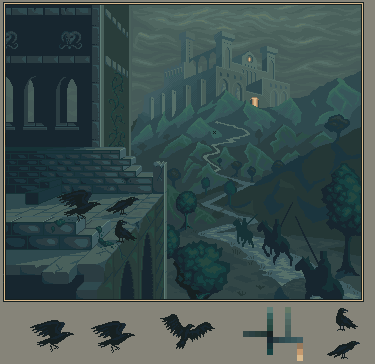 Edited by CELS - 30 October 2011 at 2:39pm |
|
|
IP Logged |
|
|
Partack
Commander
Joined: 20 October 2011 Online Status: Offline Posts: 260 |
Posted: 30 October 2011 at 2:28pm |
|
Hey =) me again ^__^ LOL @ Simpsons picture.. Very fitting
So I love the new clouds, detail of the castle, the detail of the bricks, the crows.. it's a big improvement for sure =) I don't have enough time to critique properly right now but something that popped out at me was that bright vertical line on the bottom. Not too sure but I think it's contrasting with the light of the wall connected to it on the left which has a darker shadow.. they're the same angle so they should have the same lighting right? maybe the bricks are rounded so maybe the top of the bricks should be lit to the same brightness at least? Maybe make the bricks outline protrude slightly too if they're rounded, we're looking at them from a 3/4 angle so we should be able to see their outline I think? Don't know if I'm making myself clear.. sorry, gotta run. Good luck , looking great! 
|
|
|
IP Logged |
|
|
CELS
Commander
Joined: 23 September 2022 Online Status: Offline Posts: 758 |
Posted: 30 October 2011 at 2:43pm |
|
Thanks! Good point about the bright line. I used to paint miniatures and it has left me with a bad habit of wanting to add bright lines to all the edges of things, even in pixel art.
Here's the latest version with a number of small tweaks and adjustments. I've spent way too much time on this piece over the last few weeks. If I don't submit it to the gallery soon, it's going to absorb my life. Suggestions for last changes are still welcome. 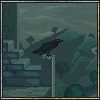 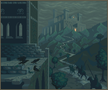 |
|
|
IP Logged |
|
|
snowk
Seaman 
Joined: 02 June 2014 Location: United States Online Status: Offline Posts: 34 |
Posted: 30 October 2011 at 6:28pm |
|
cant wait to fave this! i know it might be a bit early to talk about color, but it might be cool to see some hue variation in there.
|
|
|
-Snowk
|
|
|
IP Logged |
|
|
Cammymoop
Midshipman
Joined: 27 July 2022 Online Status: Offline Posts: 40 |
Posted: 30 October 2011 at 8:11pm |
|
This looks really cool.
as far as suggestions, (even though I'm hardly qualified to be giving any) the clouds look kinda flat they could use some perspective. Let me explain with a picture: 
</tenseconddrawing> Your clouds look like they're perpendicular to the view (on the left), while they would really be much closer to parallel with the view. Anyway it looks really great, makes me wish I had more time to draw stuff >_< |
|
|
IP Logged |
|
|
CELS
Commander
Joined: 23 September 2022 Online Status: Offline Posts: 758 |
Posted: 31 October 2011 at 12:48am |
|
Originally posted by snowk
cant wait to fave this! i know it might be a bit early to talk about color, but it might be cool to see some hue variation in there. Thanks! I assume you mean 'late' rather than 'early'. And yeah, I've pretty much settled on the colours now. It's a stylistic choice where everything is shades of blue and green to give the piece a kind of ominous, sickly feeling. Maybe it would look better with some brown and purple in there, but... I'll do that next time. Originally posted by Felix20 This looks really cool. as far as suggestions, (even though I'm hardly qualified to be giving any) the clouds look kinda flat they could use some perspective. Let me explain with a picture: </tenseconddrawing> Your clouds look like they're perpendicular to the view (on the left), while they would really be much closer to parallel with the view. Anyway it looks really great, makes me wish I had more time to draw stuff >_< Hmm, I didn't really understand what you meant at first, but as I was thinking about it in the shower this morning (see what I mean about pixel art absorbing my life?  ) I think I got it. I will make some changes later today. ) I think I got it. I will make some changes later today.And yeah, I wish I had more time to draw stuff too! So many ideas, so much to learn. |
|
|
IP Logged |
|
|
Cyangmou
Midshipman
Joined: 15 December 2022 Online Status: Offline Posts: 68 |
Posted: 31 October 2011 at 2:46am |
|
I see tons of unused potential in this piece, if you think that you worked to long on it put it away and come back to it later. The hardest thing is always that you see the things for yourself.
For me the picture doesn't really seem finished. I also don't know why you spend that much time with the foreground ruins instead of working at the really important parts, like the knights, the castle and the generall illusion of depth. The left side of the the building adds nothing to the image (I am talking of the part from the first gargoyle head to the boarder, you could delete it and it wouldn't hurt the image). As I said in my earlier posts the sky could use some more place, at the moment the castle looks squeezed in there a bit, 10-15 px + height would rather help. Then there is the perspectivic issue with the sky which were pointed out a few times and there is the same thing with the midground hills. They have the same size as the further away ones. The crow in the preview looks rather good for me, but I asked myself why don't only add that one in the image to have a small detail in there which is kind of fun and delete the other ones. The three crows you have in there have the same problem like the monster you added there before, they are unimportant, but seems to be the best outworked things. Also tweaking the anatomy and the shape of the knights and adding there the most detail would help a lot. The trees looks like candyfloss, not rather outworked, just like a rough wip. Also the path in the middle of the image looks like a loveless placed line. The atmospheric thing which could add a lot to that piece is fog. Fading away the castle into the of and placing it also between the mountains really helps, but that could be done as last step, if all other things are set down. And the next thing is to add some AA. At the moment you don't added any AA and this destroys the completely image. You usual add AA and details when the forms are OK. But Your biggest problem seems to be the majority problem. If I am looking at the image I see a castle in the fog and knights riding to it. That seems also to be the idea. If we are looking at the sentence we see "castle" and "knights". The castle seems to be outworked (except of AA and some things whhich could be solved better with lighting and shading) and the knights seems to be completely unfinished. Working out the ruin is nice, really, but it doesn't really help to make the painting better because it's simple unimportant (as I said earlier in the post). It adds a little bit to the atmosphere, but isn't a very important part for the idea and that's the reason for the building. Why not working out the most important stuff at first and after this you can play around with the unimportant stuff as long as you want. Adding new objects after the composition is done is always a really bad idea (e.g. like the 3 crows), make sure that you concentrate on the stuff you placed before and you are spending time with this. The piece itself as it is now will get maybe a place in the weekly showcase. If you'd work very hard on it I can easily imagine that it'd be a monthly top piece but that requires a seriously amount of work. P.S.: forgot to mention that you have perspectivical problems with the backwall windows and with the window ledges of the foreground windows. Edited by Cyangmou - 31 October 2011 at 2:47am |
|
|
IP Logged |
|
|
onek
Commander
Joined: 19 May 2009 Online Status: Offline Posts: 416 |
Posted: 31 October 2011 at 4:03am |
|
-everything what cyangmou said-
tried to apply some of his points 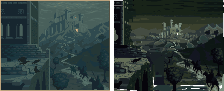
the castle this far back and small totally changes the feel of this picture and actually i like the overpowering feel of ur original much more... but yeah i wanted to show howu can illustrate more depth... the castle doesnt have to be THIS far back... keep working on this i really think u made lots of progress and this definitely has potential Edited by onek - 31 October 2011 at 4:05am |
|
|
IP Logged |
|
|
CELS
Commander
Joined: 23 September 2022 Online Status: Offline Posts: 758 |
Posted: 31 October 2011 at 6:57am |
|
Originally posted by Cyangmou
I see tons of unused potential in this piece, if you think that you worked to long on it put it away and come back to it later. The hardest thing is always that you see the things for yourself. For me the picture doesn't really seem finished. I also don't know why you spend that much time with the foreground ruins instead of working at the really important parts, like the knights, the castle and the generall illusion of depth. Thanks for the feedback! Perhaps I'll take a break for a while and come back to it, as you say. To answer your question about why I focus on certain things, I just work with anything I see as lacking. If I don't understand how to improve something, I don't work on it. I'm still very much a beginner and I have limited amounts of time to work, so I don't like to just work by experimenting blindly. Which is why I keep coming back to this forum, rather than just posting stuff to the gallery immediately.
Originally posted by Cyangmou The left side of the the building adds nothing to the image (I am talking of the part from the first gargoyle head to the boarder, you could delete it and it wouldn't hurt the image). As I said in my earlier posts the sky could use some more place, at the moment the castle looks squeezed in there a bit, 10-15 px + height would rather help. Well, originally the left building was only there to create shadow for the monster. But now that I have begun to ponder the new meaning of the pice (in my childish, amateur ways), I'm thinking that the symbolism that I'm trying to communicate is about death. Three knights, three ravens (and I believe having two different groups of objects with the same number is usually a compositional no-no, as it's something the eye picks up on) and the fact that they're riding through a valley covered in shadow. You know, the whole valley of death thing, with the ruins and the vultures.
I guess the point of the building is to add shadow and create contrast. The left side of the piece is darkness, ruins and vultures. On the right side you have the knights, riding towards some sort of goal. There's a life and death dualism there.
Again, I'm very much a beginner when it comes to these things. I'm sure it's all very banal and cliché. But one has to start somewhere, right?
 I will create more space though, as you say.
Originally posted by Cyangmou Then there is the perspectivic issue with the sky which were pointed out a few times and there is the same thing with the midground hills. They have the same size as the further away ones. Right. I'm not quite onboard concerning the hills, but I will look at it.
Originally posted by Cyangmou The crow in the preview looks rather good for me, but I asked myself why don't only add that one in the image to have a small detail in there which is kind of fun and delete the other ones. The three crows you have in there have the same problem like the monster you added there before, they are unimportant, but seems to be the best outworked things. I don't really feel that they're unimportant though. But I'm glad you like them. I could draw a single raven, but that would make the whole left side of the painting even more empty.
I do understand that the composition of the painting isn't ideal. After all, it was drawn around a monster and then the monster was removed. So if the suggestion is "why don't you remove this half and redraw everything on the other half", then I might as well start from scratch. Or draw something else entirely
Originally posted by Cyangmou Also tweaking the anatomy and the shape of the knights and adding there the most detail would help a lot. Agreed. If anyone has any suggestions, that would be much appreciated. As I said already, I think it's hard enough to draw horses, let alone doing it from this perspective.
Originally posted by Cyangmou The trees looks like candyfloss, not rather outworked, just like a rough wip. Also the path in the middle of the image looks like a loveless placed line. Alright, I'll look at this.
Originally posted by Cyangmou And the next thing is to add some AA. At the moment you don't added any AA and this destroys the completely image. My point of view is that AA isn't really something that must be done in pixel art, but I do agree that it would look good here.
Originally posted by Cyangmou You usual add AA and details when the forms are OK. But Your biggest problem seems to be the majority problem. If I am looking at the image I see a castle in the fog and knights riding to it. That seems also to be the idea. If we are looking at the sentence we see "castle" and "knights". The castle seems to be outworked (except of AA and some things whhich could be solved better with lighting and shading) and the knights seems to be completely unfinished. Cool. If you have specific ideas, I would appreciate it. "Could be better" is nice, but it leaves me with no direction.
Originally posted by Cyangmou Adding new objects after the composition is done is always a really bad idea (e.g. like the 3 crows), make sure that you concentrate on the stuff you placed before and you are spending time with this. As above, this piece is rather special in that it wasn't planned from the start. So yeah, I agree that it's better to have a plan and purpose for the composition before you start and that it's difficult to change sentral pieces underway. It goes without saying. Originally, the focus was a monster, and there were neither knights nor ravens. But if I remove those now, then I'm basically left with a dull, empty scene.
Originally posted by Cyangmou The piece itself as it is now will get maybe a place in the weekly showcase. If you'd work very hard on it I can easily imagine that it'd be a monthly top piece but that requires a seriously amount of work. I have no such aspirations yet, but I appreciate the vote of confidence (with the caveat of needing a serious amount of work). My gallery is filled with pieces that are unfinished, but I just feel that as a beginner, it doesn't seem like there is a point in spending several months on a single piece. Maybe I have the wrong attitude, but it just feels more appropriate to get some experience before I commit to a piece like that.
Anyway, I do appreciate your crushing feedback, actually. I was going to post this piece to the gallery later tonight, but now I see that it would be better to let it rest for a few days and then resume work.
Originally posted by Cyangmou P.S.: forgot to mention that you have perspectivical problems with the backwall windows and with the window ledges of the foreground windows. I thought a bit about this. I will look at the backwall windows, but I don't quite see the problem of the ledges.
Originally posted by onek -everything what cyangmou said- tried to apply some of his points the castle this far back and small totally changes the feel of this picture and actually i like the overpowering feel of ur original much more... but yeah i wanted to show howu can illustrate more depth... the castle doesnt have to be THIS far back... It's always useful to look at your remakes. As you say, the position of the castle carries a certain feel and symbolism, but I'll see if I can improve the depth of the image. I notice you've used much more contrast than me (a recurring principle in your edits of my work
 ), and it does look very pretty, but I wonder if it destroys the illusion of fog? I will try to experiment with the palette. ), and it does look very pretty, but I wonder if it destroys the illusion of fog? I will try to experiment with the palette.Originally posted by onek keep working on this i really think u made lots of progress and this definitely has potential Thanks, onek! Edited by CELS - 31 October 2011 at 7:01am |
|
|
IP Logged |
|
|
Partack
Commander
Joined: 20 October 2011 Online Status: Offline Posts: 260 |
Posted: 04 November 2011 at 11:52pm |
|
Just dropping in to say, wow... what a difference onek's edit made.. I've not seen such a dramatic edit on a piece before.. Really made me think more about looking past what I see and really shaping it into something.. more?.. no disrespect to you CELS, your work is wonderful but I really do like the edit..
as a side note, the edit DOES destroy the illusion of fog. but with the castle so bright, where is the light coming from?.. if there was fog, there wouldn't be much light, it would be an aura sorta light i think.. With the light pitching from the right, It would seem the sky isn't completely overcast and there are patchy clouds outside the picture. personally i prefer it this way.. although there are wisps of fog here and there at a dark kinda, brownish tone, maybe you could play with that? Edited by Partack - 05 November 2011 at 12:03am |
|
|
IP Logged |
|
|
CELS
Commander
Joined: 23 September 2022 Online Status: Offline Posts: 758 |
Posted: 05 November 2011 at 4:07pm |
|
As I wrote before, I think onek's edit is very pretty. I like the modification of the ruins, I like the increased contrast of the nearest scenery, I like the new skies...
But I do want fog. And I may go with the flock of ravens, despite popular consensus. |
|
|
IP Logged |
|
|
Partack
Commander
Joined: 20 October 2011 Online Status: Offline Posts: 260 |
Posted: 06 November 2011 at 4:08pm |
|
I personally like the crows. all of em.
|
|
|
IP Logged |
|
|
onek
Commander
Joined: 19 May 2009 Online Status: Offline Posts: 416 |
Posted: 06 November 2011 at 9:22pm |
|
its true, because of the high contrast and the more vibrant colors scheme my edit doesnt lookfoggy anymore..
i understand that u want to go for the foggy look, but currently it looks more like moonlihgt imo to make it foggy the contrast should be even lower and the bg can get even lighter. also u should add patches of fog-- like clouds layin on the ground.. i tried that in my edit , but becasue of previos mentioned issues it doesnt really work... somewhat like so 
|
|
|
IP Logged |
|
|
sasuke91
Midshipman
Joined: 13 December 2010 Online Status: Offline Posts: 44 |
Posted: 11 November 2011 at 6:31am |
|
wow this is looking great, cant wait to see the final peice :D

|
|
|
IP Logged |
|
| << Prev Page of 2 |
| |
||
Forum Jump |
You cannot post new topics in this forum You cannot reply to topics in this forum You cannot delete your posts in this forum You cannot edit your posts in this forum You cannot create polls in this forum You cannot vote in polls in this forum |
|
