| Active TopicsSearchRegisterLogin |
| WIP (Work In Progress) | |
| |
  |
| Author | Message |
|
BrightBit
Midshipman 
Joined: 11 May 2014 Online Status: Offline Posts: 98 |
  Topic: Tiny People Topic: Tiny PeoplePosted: 26 July 2011 at 7:49am |
|
Hello Pixeljoint community,
I am creating some character graphics for a roguelike game. For some other graphics related to this game there already is a thread created by me, see: Roguelike Mockup. The characters are too small for this thread, though. So I want to get critiques and comments in an additional thread. Currently I am working on a female counterpart of the male figure. The image below shows some variations of this woman and the male version for comparison. The version in the rectangle is my favorite so far.  What do you guys say about the second version? The pose looks a bit more feminin but doesn't read that well in higher resolutions or if integrated into my mockup (see the thread mentioned above). |
|
 IP Logged IP Logged |
|
|
CELS
Commander 
Joined: 23 September 2022 Online Status: Offline Posts: 758 |
Posted: 26 July 2011 at 7:58am |
|
The first and second from the left look a lot more feminine in my eyes, in terms of their pose. The third one is good, but looks like she's poking her belly rather than holding a hand on her hip. I guess the fourth and fifth from the left are holding a hand in their pocket? If they're putting a hand on their hip, I would make it a pixel longer. The lady on the far right looks like David Hasselhoff.
|
|
|
IP Logged |
|
|
BrightBit
Midshipman
Joined: 11 May 2014 Online Status: Offline Posts: 98 |
Posted: 26 July 2011 at 10:50am |
|
Originally posted by CELS The lady on the far right looks like David Hasselhoff The lady on the far right is allowed to look like Hasselhoff because she is a man.  Thanks for your opinion, though. Since I liked the pose of the second woman from the left the most (I just thought it wouldn't read well) I returned to this version.  As you can see I made some nude versions as well. (I hope this isn't violating some rules here or that someone finds it nasty or displeasing. In my opinion they look rather cute and funny.  ) )I have problems with the neckline of the man. I don't know how to make the dark bits disappear without violating the overall shape. Edited by BrightBit - 26 July 2011 at 10:51am |
|
|
IP Logged |
|
|
eghost
Midshipman
Joined: 19 June 2018 Location: United States Online Status: Offline Posts: 99 |
Posted: 26 July 2011 at 7:11pm |
|
Hope you don't mind that I made an edit... As it is these are already really solid...
Edit: 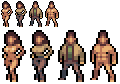
Orig:
|
|
|
IP Logged |
|
|
BrightBit
Midshipman
Joined: 11 May 2014 Online Status: Offline Posts: 98 |
Posted: 27 July 2011 at 3:21am |
|
Originally posted by eghost Hope you don't mind that I made an edit... As it is these are already really solid... Hey, thank you. I really like your edit, especially for the woman. Removing the nipple and instead emphasizing the overall shape of the breasts really improves the readability (even for higher resolutions, i.e. not zoomed in). Thank you! The one missing pixel below the man's neckline did help a bit but I still think it's too dark there. Anyhow, I really appreciate your help. :-) Greetings BrightBit Edited by BrightBit - 27 July 2011 at 5:06am |
|
|
IP Logged |
|
|
eghost
Midshipman
Joined: 19 June 2018 Location: United States Online Status: Offline Posts: 99 |
Posted: 27 July 2011 at 8:44am |
|
Happy to help out... One thing that you might get some mileage out of is switching the black outlines to a dark, desaturated purple... #4f394e looks pretty good with your skin tones, but you could also go a bit darker if you wanted...
|
|
|
IP Logged |
|
|
BrightBit
Midshipman
Joined: 11 May 2014 Online Status: Offline Posts: 98 |
Posted: 27 July 2011 at 3:38pm |
|
Thanks, I tried the purple outline but IMHO it doesn't matter that much and I prefer black to emphasize the game elements.
Here's another update (flipped the sides to trick the eyes [helps to find errors]):  |
|
|
IP Logged |
|
|
eghost
Midshipman
Joined: 19 June 2018 Location: United States Online Status: Offline Posts: 99 |
Posted: 27 July 2011 at 7:45pm |
|
Looks good...Like what you did with the hair for the female sprite...
Another Edit: 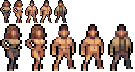
Again, very few modifications...These are really well done... And of course now you've got me wanting to get back to the ultra-small pixel pieces...:P Can't wait to see how your Roguelike turns out... Edited by eghost - 28 July 2011 at 1:37pm |
|
|
IP Logged |
|
|
BrightBit
Midshipman
Joined: 11 May 2014 Online Status: Offline Posts: 98 |
Posted: 31 July 2011 at 1:56pm |
|
Thanks again eghost,
I applied most of your changes. I don't like the changes on the man's belly, though. But I understand why you tried to change it.  |
|
|
IP Logged |
|
| |
||
Forum Jump |
You cannot post new topics in this forum You cannot reply to topics in this forum You cannot delete your posts in this forum You cannot edit your posts in this forum You cannot create polls in this forum You cannot vote in polls in this forum |
|
