| Active TopicsSearchRegisterLogin |
| WIP (Work In Progress) | |
| |
  |
| Author | Message |
|
Andrew-M
Commander 
Joined: 08 February 2011 Online Status: Offline Posts: 195 |
  Topic: A tree and grass Topic: A tree and grassPosted: 10 October 2011 at 3:29pm |
|
I've never been good at making things like this:
 What am I doing wrong?
|
|
 IP Logged IP Logged |
|
|
CELS
Commander
Joined: 23 September 2022 Online Status: Offline Posts: 758 |
Posted: 10 October 2011 at 4:06pm |
|
I took the liberty of doing an edit. I'm not sure this is better, but perhaps you can use some of it. Others will help too, I'm sure.
 I tried to change the colours a bit, as the greens you used were all rather similar in hue. The main difference was the amount of shade. So I tried to make the brighter greens more yellow, and the darker greens more blue (your dark greens were actually more yellow). I also tried to fix the low contrast between the sky and the brightest part of the tree, so it's easier to see the outline of the tree. Your light source seems to be directly to the right of the tree (you have shadows on top), like in a sunset, but the sky is blue as if it's the middle of a clear day. I moved the light source a bit higher up. Your grass is bright in front and darker in the distance. I switched that up, making it high contrast in the front, and less contrast in the distance. I'm not sure if I did this well, I'm not good at drawing grass. Edited by CELS - 10 October 2011 at 4:07pm |
|
|
IP Logged |
|
|
shampoop
Commander
Joined: 12 January 2015 Online Status: Offline Posts: 202 |
Posted: 10 October 2011 at 4:15pm |
|
I suggest typing "tree" in the search text box on the homepage. hundreds of examples.
|
|
|
IP Logged |
|
|
Friend
Commander
Joined: 01 April 2015 Online Status: Offline Posts: 710 |
Posted: 10 October 2011 at 4:45pm |
|
I expanded a smidgen on CELS' great ideas, and a few of my own

|
|
|
IP Logged |
|
|
mdog95
Commander
Joined: 14 December 2017 Online Status: Offline Posts: 150 |
Posted: 10 October 2011 at 5:41pm |
|
So basically, give it the irregular shape, shadowing, highlights, etc of a tree you would see in real life. If it doesn't quite look like a tree in all its glory, keep adding shadows until it just looks right.
|
|
|
IP Logged |
|
|
ChrisButton
Commander
Joined: 10 September 2010 Online Status: Offline Posts: 371 |
Posted: 10 October 2011 at 5:57pm |
|
Originally posted by mdog95
Keep adding shadows until it just looks right. Not necessarily, sometimes less is more.
They say in art that every stroke should be contributing to the piece.
Trees aren't that hard to draw, you just have to think about how it's
shape is or make a plan on paper of how you want it to be.
|
|
|
IP Logged |
|
|
Andrew-M
Commander
Joined: 08 February 2011 Online Status: Offline Posts: 195 |
Posted: 10 October 2011 at 6:20pm |
|
Thank you all for the help, hopefully this is better:
 |
|
|
IP Logged |
|
|
jalonso
Admiral 
Joined: 29 November 2022 Online Status: Offline Posts: 13537 |
Posted: 10 October 2011 at 6:37pm |
|
Its better, but you can do better ;)
*Remember our last convo. Edited by jalonso - 10 October 2011 at 6:37pm |
|
|
|
|
|
IP Logged |
|
|
mdog95
Commander
Joined: 14 December 2017 Online Status: Offline Posts: 150 |
Posted: 10 October 2011 at 6:54pm |
|
Originally posted by ChrisButton
Originally posted by mdog95
Keep adding shadows until it just looks right. Not necessarily, sometimes less is more.
They say in art that every stroke should be contributing to the piece.
Trees aren't that hard to draw, you just have to think about how it's
shape is or make a plan on paper of how you want it to be. That's not necessarily what I meant. I didn't mean to keep adding shadows and highlights until it's too much to look at. I really meant, if it doesn't look right, erase it and try again. |
|
|
IP Logged |
|
|
Andrew-M
Commander
Joined: 08 February 2011 Online Status: Offline Posts: 195 |
Posted: 10 October 2011 at 7:51pm |
|
Thanks for motivating me jalonso, I changed a couple things:
 Edited by Andrew-M - 11 October 2011 at 12:38am |
|
|
IP Logged |
|
|
jalonso
Admiral
Joined: 29 November 2022 Online Status: Offline Posts: 13537 |
Posted: 11 October 2011 at 5:33am |
|
Still not there.
The colors are not quite right, at least the blue. The treetop is just a ball colored in a way that does not read foliage. The trunk is not in proportion to the treetop and perhaps too thick. The grass is over pixelled for the tree, which is the focal point. Google for tree refs like this HERE and search the gallery for trees to see pixelled trees. |
|
|
|
|
|
IP Logged |
|
|
Andrew-M
Commander
Joined: 08 February 2011 Online Status: Offline Posts: 195 |
Posted: 11 October 2011 at 3:48pm |
|
Thanks for the help, I changed 1 and 2, i'll do 3 and 4 later:
 |
|
|
IP Logged |
|
|
Friend
Commander
Joined: 01 April 2015 Online Status: Offline Posts: 710 |
Posted: 11 October 2011 at 4:35pm |
|
I think the biggest issue is that you shaded the trunk and the leaves not only as if they are flat objects, but as if they are the same 3D shape. A tree trunk is obviously going to be a pretty round object, so the shading will be split into 3 vertical parts. The skinny bright end where the lightsource is, the fat middle section of a middle brightness, and finally, another skinny section, but dark. See CELS' tree trunk.
I think that is hopefully reliable help, I'm not the best at shading either :p |
|
|
IP Logged |
|
|
Andrew-M
Commander
Joined: 08 February 2011 Online Status: Offline Posts: 195 |
Posted: 11 October 2011 at 5:36pm |
|
Wow this is confusing
 I changed a color, tried to fix the grass, and changed the shading of the trunk:
 I hope I did this right...
|
|
|
IP Logged |
|
|
CELS
Commander
Joined: 23 September 2022 Online Status: Offline Posts: 758 |
Posted: 11 October 2011 at 5:54pm |
|
Originally posted by shampoop I suggest typing "tree" in the search text box on the homepage. hundreds of examples. Looking at other examples will only get you so far. As a beginner (like myself), one will only notice a certain number of things by studying the work of others and reference pictures. Some people are more artistic and have better perception than others, but I think everyone benefits more from edits and concrete suggestions than simply looking at examples. Of course, the best is to do all of the above  FrostButt makes a good point about the 3D, but I can understand how it seems confusing. People have recommended that I think in 3D when I draw, which always leaves me wondering "Ok, how?" The first thing (which has already been suggested) is to try to divide each object into similar 3D objects. For example, a boxy car (like a Volvo stationwagon) is basically a cube, or several cubes, and should be shaded accordingly. A tree is basically a cylinder (the trunk) and a sphere (the foliage), but actually the foliage is made up from several spheres, and actually they're not spheres at all, so you shouldn't draw the foliage like a bunch of grapes. But there are some similarities, so it's useful to visualize that the the top of the tree consists of different chunks, which may cast shadow on each other, etc. Each chunk is perhaps similar to a sphere, so you might want to look up some tutorials on how spheres should be shaded. Tutorials, tutorials, tutorials. There are a bunch of great ones on here, and learning from them is easier and better than having people like me explain simple things with long and wordy posts like this. Right now, the tree has a very straight line which separates the bright bit from the shade. This makes it look like the tree consists of two flat surfaces, separated by a sharp edge, much like a box. Which brings us back to the point of thinking in 3D. Edited by CELS - 11 October 2011 at 5:55pm |
|
|
IP Logged |
|
|
Delicious
Rear Admiral 
Joined: 18 January 2015 Online Status: Offline Posts: 273 |
Posted: 11 October 2011 at 8:57pm |
|
It looks flat. To do it right, you must invision it as a 3D object.
I'd often tell people to scale down, but you should considering going a bit larger on this piece to learn anything from it. At that scale, you barely will understand the importance of the structure.
The lightsource is on the right, which is evident in your work. However, light casts shadows where it doesn't hit. the light would be hitting the top of the leafs and the side of the trunk which isn't covered by the leafs, basically casting a shadow on the upper part of the trunk. It really isn't that confusing, you just need to look at references to understand properly.
My example is really basic. I mean, the shadow wouldn't really appear to be that solid on the trunk because leaves do shine light through them, however it's very difficult to imitate it properly in pixels at such a small scale.
 Hope it helps. I'll edit this in a later time with a better critic, in a hurry atm.
|
|
|
IP Logged |
|
|
Andrew-M
Commander
Joined: 08 February 2011 Online Status: Offline Posts: 195 |
Posted: 11 October 2011 at 11:12pm |
|
Thank you both for the help, I tried to think in 3d while making this:
 I'm sorry if this is still wrong, this is really hard for me...
|
|
|
IP Logged |
|
|
Delicious
Rear Admiral
Joined: 18 January 2015 Online Status: Offline Posts: 273 |
Posted: 12 October 2011 at 1:16am |
|
Jotted down some notes. Also, no need to say sorry! We are only hear to help you, I'm glad you're listening and trying your best, that's the most you could give us in return. :)  My previous edit is basically the same thing, but I just toned it down to the current size and tried to pull you on a different approach with some new points.
Basically, you did get the whole lightsource idea correct, however it still appears flat. Look at references, please. Also, you could definitely look through the gallery on Pixeljoint and see how other artists tackle trees in this medium, it's definitely not easy to pull off! Study it closely.
Good luck!
|
|
|
IP Logged |
|
|
Andrew-M
Commander
Joined: 08 February 2011 Online Status: Offline Posts: 195 |
Posted: 12 October 2011 at 4:08pm |
|
Thank you for the help Delicious, I hope this is better:
 Also, I have looked at some trees from pixeljoint and google images.
|
|
|
IP Logged |
|
|
mdog95
Commander
Joined: 14 December 2017 Online Status: Offline Posts: 150 |
Posted: 12 October 2011 at 5:46pm |
|
This is a lot better than what you started off with, but some shadowing still doesn't seem right. While you do have a shadow coming from the leaves and the two branches are going to be affected, that doesn't mean you can't add a very slight dimension to them For example a very small amount of light reflecting off the grass could slightly lighten some areas in them so they don't look so flat. You could also dither in a lighter blue to the background so it's not one flat color. It's small details like that that can make something look great. I made a slight edit to show you what I mean. I didn't have the greatest dithering length because I'm in a hurry atm.

|
|
|
IP Logged |
|
|
Andrew-M
Commander
Joined: 08 February 2011 Online Status: Offline Posts: 195 |
Posted: 12 October 2011 at 6:58pm |
|
I changed the grass:
 mdog95, I'm not sure but I don't think the dithering would look good...
|
|
|
IP Logged |
|
|
CELS
Commander
Joined: 23 September 2022 Online Status: Offline Posts: 758 |
Posted: 12 October 2011 at 7:10pm |
|
Notice how the foliage looks in Delicious' edit . You've divided the different shades into basically concentric [jagged] circles. Unless you want the tree to look as smooth as a tennis ball, you might want to do something similar to the way Delicious has done it. Instead of smooth curves in concentric circles, the different layers of shade really show that the tree has an irregular shape, as is normally the case with trees. There is no particular pattern, as in your latest version.
I agree that the dithering is not really an improvement, in this case. Edited by CELS - 12 October 2011 at 7:11pm |
|
|
IP Logged |
|
|
mdog95
Commander
Joined: 14 December 2017 Online Status: Offline Posts: 150 |
Posted: 12 October 2011 at 7:39pm |
|
Yeah, I kinda figured that out when I looked at it, but I needed to work on a research paper, so I just posted it. But I do think the slight rounding in the two branches made a difference.
|
|
|
IP Logged |
|
|
Andrew-M
Commander
Joined: 08 February 2011 Online Status: Offline Posts: 195 |
Posted: 12 October 2011 at 8:05pm |
|
Is this better?
 |
|
|
IP Logged |
|
|
CELS
Commander
Joined: 23 September 2022 Online Status: Offline Posts: 758 |
Posted: 12 October 2011 at 8:47pm |
|
The trunk is better. The foliage is basically the same.
I'm not sure if you don't understand what I'm suggesting, or if you just disagree with me. But here's a last ditch effort to explain what I mean. 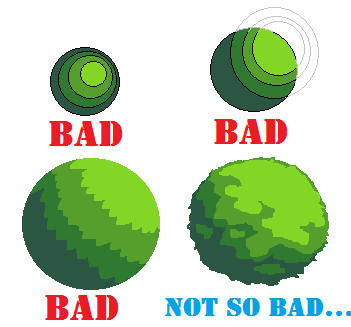 |
|
|
IP Logged |
|
|
mdog95
Commander
Joined: 14 December 2017 Online Status: Offline Posts: 150 |
Posted: 12 October 2011 at 8:48pm |
|
The texture of the leaves still isn't irregular enough. Try to make it look like Delicious' edit.
Wow, the lag made CELS' post in front of mine. That was toward the latest tree. Edited by mdog95 - 12 October 2011 at 8:49pm |
|
|
IP Logged |
|
|
Andrew-M
Commander
Joined: 08 February 2011 Online Status: Offline Posts: 195 |
Posted: 12 October 2011 at 8:51pm |
|
Sorry CELS, I didn't understand what you meant. I'll change it...
Edit:
 Edited by Andrew-M - 12 October 2011 at 9:40pm |
|
|
IP Logged |
|
|
ChrisButton
Commander
Joined: 10 September 2010 Online Status: Offline Posts: 371 |
Posted: 13 October 2011 at 6:19am |
|
Don't be a perfectionist, but at the same time be a perfectionist in what you're trying to achieve. Make sense? :-D
|
|
|
IP Logged |
|
|
Andrew-M
Commander
Joined: 08 February 2011 Online Status: Offline Posts: 195 |
Posted: 13 October 2011 at 3:07pm |
|
Do you mean I should make sure the tree and grass is the best that it can be? I'm trying to do that, it's hard though.
I changed a color:
 Edited by Andrew-M - 13 October 2011 at 3:07pm |
|
|
IP Logged |
|
|
jalonso
Admiral
Joined: 29 November 2022 Online Status: Offline Posts: 13537 |
Posted: 13 October 2011 at 3:39pm |
|
Waaaaaaaaaaay better! on the tree top.
Work on the trunk a little. Its a bit too thick (some trees can have thick truncks), here it just looks disproportionate to the tree top. The sky blue is perhaps too dark and too close to the highlight green. Edited by jalonso - 13 October 2011 at 3:39pm |
|
|
|
|
|
IP Logged |
|
|
Andrew-M
Commander
Joined: 08 February 2011 Online Status: Offline Posts: 195 |
Posted: 13 October 2011 at 4:26pm |
|
Thank you for the help jalonso:
 |
|
|
IP Logged |
|
|
mdog95
Commander
Joined: 14 December 2017 Online Status: Offline Posts: 150 |
Posted: 13 October 2011 at 7:05pm |
|
Maybe you should make the sky closer to the shade of blue I attempted to dither in, but not quite that bright.
|
|
|
IP Logged |
|
|
Andrew-M
Commander
Joined: 08 February 2011 Online Status: Offline Posts: 195 |
Posted: 13 October 2011 at 7:51pm |
|
Edit:
 I tried making the sky brighter and I think it might be better now, thanks for the help. Edited by Andrew-M - 14 October 2011 at 1:26am |
|
|
IP Logged |
|
|
Club Beuker
Commander
Joined: 29 January 2007 Online Status: Offline Posts: 513 |
Posted: 14 October 2011 at 1:55am |
|
Look at the improvement you've made:
You can be very proud of yourself! |
|
|
Without me, it's just aweso
|
|
|
IP Logged |
|
|
jalonso
Admiral
Joined: 29 November 2022 Online Status: Offline Posts: 13537 |
Posted: 14 October 2011 at 6:18am |
|
1- your current pixel
2- your art with different colors, which are not great, but should illustrate how your much improved update still has a 'definition' problem. Play with colors, look at other's art, experiment until it looks right to you and post. 3- Your art with some editing and 1 color added. Here I broke up the treetop shape just enough so its not a 'ball' The colors here are all chosen so that one of the green shades can be used for AAing the trunk. Sometimes all colors revolve around one single 'key' shade. One extra yellow added to further break the 'ball' 4- Hopefully shows you how a better proportioned *trunk <|> treetop* can completely elevate your piece.  5- Do your own thing, keep your vision. This edit is just a visual comment not a cheat sheet. |
|
|
|
|
|
IP Logged |
|
|
Andrew-M
Commander
Joined: 08 February 2011 Online Status: Offline Posts: 195 |
Posted: 14 October 2011 at 3:21pm |
|
Club Beuker, thank you!
Is this good so far?
 Edited by Andrew-M - 14 October 2011 at 3:24pm |
|
|
IP Logged |
|
|
seiseki
Seaman 
Joined: 18 February 2022 Online Status: Offline Posts: 15 |
Posted: 14 October 2011 at 3:39pm |
|
By extending the "strokes" like that it looks more like fur rather than leaves. I think that's also because they are too pointy.
That style could work quite well for pinetrees though :P |
|
|
IP Logged |
|
|
jalonso
Admiral
Joined: 29 November 2022 Online Status: Offline Posts: 13537 |
Posted: 14 October 2011 at 3:48pm |
|
You are doing great!
Honestly if you submit this to the gallery it will be added but I honestly want you to learn a little more about composition, proportion and color choices. Please click the edit I made and zoom in enough to see the pixels and colors and their interaction. There is much you can still learn with this piece. |
|
|
|
|
|
IP Logged |
|
|
Andrew-M
Commander
Joined: 08 February 2011 Online Status: Offline Posts: 195 |
Posted: 14 October 2011 at 4:10pm |
|
Thanks for the help seiseki, I made it less pointy:
 Thank you jalonso, i'll keep working on this and i'll study your edit more.
Edit:
 Changed a couple things... Edited by Andrew-M - 14 October 2011 at 4:46pm |
|
|
IP Logged |
|
|
jeremy
Rear Admiral
Joined: 25 November 2024 Location: New Zealand Online Status: Offline Posts: 1704 |
Posted: 14 October 2011 at 5:01pm |
|
Great improvement so far, but something definitely needs to be done with the blue. It's so close in value and saturation to the green that it draws attention too much. Make it lighter, maybe change the saturation and hue too (look at jal's)
Imo the trunk colour is a bit red, but that's no biggie. You do have some banding (point 4 in the link) which stands out though.  |
|
|
IP Logged |
|
|
Andrew-M
Commander
Joined: 08 February 2011 Online Status: Offline Posts: 195 |
Posted: 14 October 2011 at 6:20pm |
|
Thanks for the help Jeremy:
 I changed the color of the sky, removed the banding, added some aa to the trunk like in you and jalonso's edit, and changed a couple other things.
This is my first time with banding and aa, so i'm not sure if I removed the banding and added the aa right.
|
|
|
IP Logged |
|
|
jalonso
Admiral
Joined: 29 November 2022 Online Status: Offline Posts: 13537 |
Posted: 14 October 2011 at 6:26pm |
|
You have AAd just fine. Not much banding to bother with but remember that banding is not pretty looking so try to always catch that when you pixel.
About the blue...You don't seem to understand that the blues you have been using are bad choices. Its very important for you to see and understand why it is bad in this piece. Do you? |
|
|
|
|
|
IP Logged |
|
|
jalonso
Admiral
Joined: 29 November 2022 Online Status: Offline Posts: 13537 |
Posted: 14 October 2011 at 6:41pm |
|
RED- these 2 colors are almost the same in value and level
BLACK- these 2 colors are almost the same in value and level Since there is enough difference between the 2 greens then its the blue that's the problem. PURPLE- Find a blue that you like but works with the two greens. If you just love that blue then adjust all the greens.  |
|
|
|
|
|
IP Logged |
|
|
Andrew-M
Commander
Joined: 08 February 2011 Online Status: Offline Posts: 195 |
Posted: 14 October 2011 at 7:03pm |
|
Sorry jalonso, I guess i'm not too good with colors yet...
 I hope this is better.
|
|
|
IP Logged |
|
|
jalonso
Admiral
Joined: 29 November 2022 Online Status: Offline Posts: 13537 |
Posted: 14 October 2011 at 7:04pm |
|
Colors are very tough, yes. In pixelart more than normal.
This update is so much better. Do you understand why the blue was not working? Don't be sorry, silly. Edited by jalonso - 14 October 2011 at 7:04pm |
|
|
|
|
|
IP Logged |
|
|
Andrew-M
Commander
Joined: 08 February 2011 Online Status: Offline Posts: 195 |
Posted: 14 October 2011 at 7:14pm |
|
I think I understand now, there wasn't enough contrast with the blue and the lightest green.
Edited by Andrew-M - 14 October 2011 at 7:14pm |
|
|
IP Logged |
|
|
jalonso
Admiral
Joined: 29 November 2022 Online Status: Offline Posts: 13537 |
Posted: 14 October 2011 at 7:32pm |
|
Yes you can call it contrast but really its more about the value and levels of the colors.
I see you have no avatar. Maybe you can use this as your avatar once its in the gallery  |
|
|
|
|
|
IP Logged |
|
|
Andrew-M
Commander
Joined: 08 February 2011 Online Status: Offline Posts: 195 |
Posted: 14 October 2011 at 11:16pm |
|
I probably wont, i'll make an avatar someday though...
I changed some things:
 Edit:This is finished now. Thank you all for helping me, I learned a lot while working on this. Edited by Andrew-M - 15 October 2011 at 2:14pm |
|
|
IP Logged |
|
| |
||
Forum Jump |
You cannot post new topics in this forum You cannot reply to topics in this forum You cannot delete your posts in this forum You cannot edit your posts in this forum You cannot create polls in this forum You cannot vote in polls in this forum |
|
