| Active TopicsSearchRegisterLogin |
| WIP (Work In Progress) | |
| |
  |
| Author | Message |
|
megablast2
Seaman 
Joined: 30 July 2012 Online Status: Offline Posts: 5 |
  Topic: game in space Topic: game in spacePosted: 01 March 2013 at 5:37am |
|
hello :),
This is the first graphic for a zleda-like game in the space:). What do you think it?  Edited by megablast2 - 01 March 2013 at 11:45am |
|
 IP Logged IP Logged |
|
|
crozier
Commander 
Joined: 08 May 2023 Online Status: Offline Posts: 190 |
Posted: 01 March 2013 at 2:44pm |
|
What do I think? Well the outline on the monsters/lazer light don't look that good. There is some pillowshading on the door. A few of the colors are drab looking, the hues and saturation just feel a little odd (ie whatever that purple thing is in the corner, and the lazer). Is this top-down or 3/4 view? The doors really throw off the perspective.
Oh and some floor tiles would be really nice. Loving the box and the red button btw. And welcome to pixeljoint! Edited by crozier - 01 March 2013 at 2:44pm |
|
|
IP Logged |
|
|
megablast2
Seaman
Joined: 30 July 2012 Online Status: Offline Posts: 5 |
Posted: 02 March 2013 at 2:29pm |
|
Thanks for your poste :).
For 'The doors really throw off the perspective' you say of all doors? |
|
|
IP Logged |
|
|
crozier
Commander
Joined: 08 May 2023 Online Status: Offline Posts: 190 |
Posted: 02 March 2013 at 3:05pm |
|
The leftmost door is ok, but the upper and lower right ones (the ones leaning to the left and right) just feel odd.
Side note the rooms are kind of empty looking. |
|
|
IP Logged |
|
|
megablast2
Seaman
Joined: 30 July 2012 Online Status: Offline Posts: 5 |
Posted: 12 March 2013 at 9:09am |
|
hello :),
I'm working the decors. 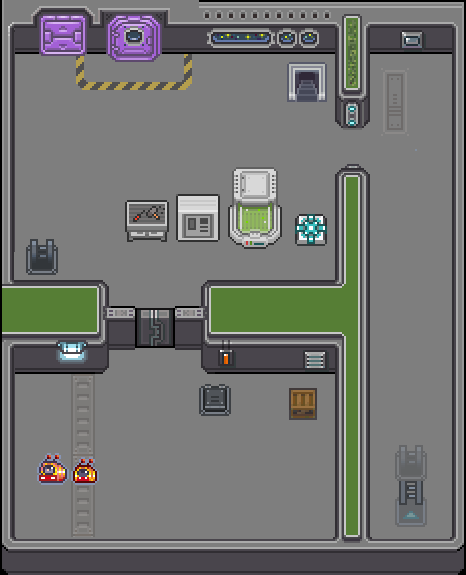 |
|
|
IP Logged |
|
|
DragonMarx
Seaman
Joined: 11 September 2021 Online Status: Offline Posts: 7 |
Posted: 12 March 2013 at 11:44am |
|
I really have to say that the addition of the green really made a difference!
|
|
|
IP Logged |
|
|
showtime
Commander
Joined: 14 May 2020 Online Status: Offline Posts: 105 |
Posted: 12 March 2013 at 11:49am |
|
That's a huge improvement perspective-wise, way less confusing
|
|
|
IP Logged |
|
|
megablast2
Seaman
Joined: 30 July 2012 Online Status: Offline Posts: 5 |
Posted: 26 March 2013 at 7:40am |
|
Hello :),
This is my wall : 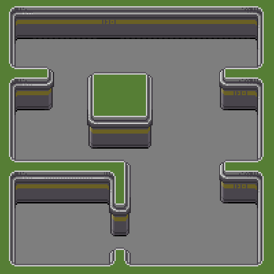  Edited by megablast2 - 26 March 2013 at 10:14pm |
|
|
IP Logged |
|
|
megablast2
Seaman
Joined: 30 July 2012 Online Status: Offline Posts: 5 |
Posted: 22 May 2013 at 5:31am |
|
hello :),
The continuation :  Edited by megablast2 - 22 May 2013 at 5:36am |
|
|
IP Logged |
|
|
Stevie
Seaman
Joined: 20 May 2013 Online Status: Offline Posts: 14 |
Posted: 22 May 2013 at 6:06pm |
|
I'm just a newbie here myself, but I really like what you have so far. Your style is great and I love the coloring.
|
|
|
IP Logged |
|
|
ultimaodin
Commander
Joined: 04 May 2010 Location: Australia Online Status: Offline Posts: 162 |
Posted: 22 May 2013 at 6:34pm |
|
Looking good - the mapping is still a bit open but that'll come with more assets. It could use more of the space feel.
|
|
|
The world is but a shadow of emotion, cast in shades of grey.
|
|
|
IP Logged |
|
|
programgamer
Midshipman 
Joined: 07 September 2020 Online Status: Offline Posts: 71 |
Posted: 22 May 2013 at 6:44pm |
|
You know what would make it have more of a space athmosphere? First, taller walls with big glass windows to give a feeling of, well, space! Second, you should make everything cluttered with wires and gadgets, make it feel techy and stuff. That's pretty much all I have to say other than good job on this one!
|
|
|
IP Logged |
|
| |
||
Forum Jump |
You cannot post new topics in this forum You cannot reply to topics in this forum You cannot delete your posts in this forum You cannot edit your posts in this forum You cannot create polls in this forum You cannot vote in polls in this forum |
|
