| Active TopicsSearchRegisterLogin |
| WIP (Work In Progress) | |
| |
  |
| Author | Message |
|
Ego
Midshipman 
Joined: 19 May 2015 Online Status: Offline Posts: 44 |
  Topic: Learning Pixel Art Cover Image (Update 1/17) Topic: Learning Pixel Art Cover Image (Update 1/17)Posted: 23 November 2014 at 3:48am |
|
Hey folks. I'm not normally one to take any real advantage of the WIP forum, partly because I rarely pixel for more than a sitting or three on a piece, but for this one I want to make sure it gets as good as I can possibly make it.
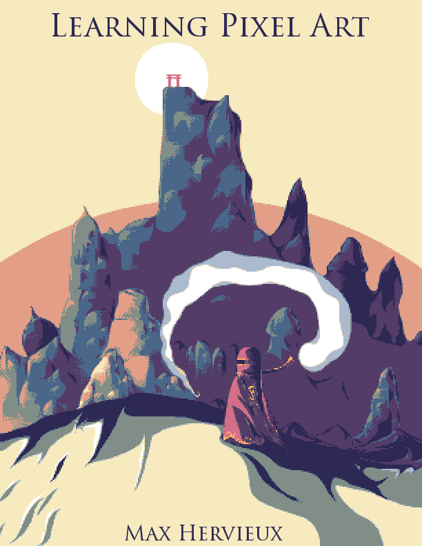
Background: This is for the cover of a book / tutorial I've written called Learning Pixel Art, which is a full introduction to the techniques and concepts of pixel art. I intend to sell the book for a paltry $1 (as an ebook or pdf) and frankly I think the work I've put into it is worth it, but that's not the point. The point is, if I'm gonna present a document about learning to pixel, I better damn well prove that I know how to pixel. Problem: I'm a far better writer about pixel art than I am an actual pixel artist. For that reason I'm trying to spend a bunch of effort on a genuinely good piece for the cover. Final (?):  12 colors total. Any suggestions on what to fix now? Old Versions: Original Composition Sketch First Draft Second Draft References: This composition was originally inspired by a piece by Yosh*taka Amano.. The Piece In Question The blend of desert scene, grand scale, ancient feel, character, and fantasy really speaks to me. It's one of my favorite pieces by Amano. The original draft of this piece intended a city, but I think I actually prefer the mountains, plus I don't know how to draw cities very well. Additionally, the character's silhouette here takes somewhat from the game Journey's protagonist, a game which has had a pretty lasting impact on my mental imagery of deserts. You'd think literally visiting the Sahara would have more of an impact than a video game I've never played, but whatever. So does anyone have any feedback? Even affirmation that I seem to be on the right path is better than silence. Thanks y'all! Edited by Ego - 18 January 2015 at 1:14am |
|
 IP Logged IP Logged |
|
|
DatMuffinMan
Commander 
Joined: 03 April 2023 Online Status: Offline Posts: 150 |
Posted: 23 November 2014 at 6:35am |
|
2nd link (piece in question) doesn't lead to anything.
to be honest it looks pretty nice, but i'd ditch the lines where you don't need 'em. Would give it more of a background-y painterly feel I think. |
|
|
IP Logged |
|
|
jalonso
Admiral 
Joined: 29 November 2022 Online Status: Offline Posts: 13537 |
Posted: 23 November 2014 at 6:46am |
|
It looks nice and agree with mufffin that the linearts bits are no needed here.
Because the subject matter is pixelart and you are going for a somewhat abstract cover art I would strongly consider using pixelart techniques as elements of the art with purpose. Those lineart bits you could emphasize some selout example. Another example. Include some bits (clouds,BG mountains, foreground) as pure dithering to visually show 'pixels'. You show some AA in the white area already. Essentially bring up the pixels in the art just enough to show themselves without overtaking the scene. |
|
|
|
|
|
IP Logged |
|
|
jtfjtfjtf
Commander
Joined: 17 July 2018 Online Status: Offline Posts: 162 |
Posted: 23 November 2014 at 2:26pm |
|
Fool's landscape pieces are always great to study. His use of atmospheric perspective in pixel art and his palette choices are incredible.
http://www.pixeljoint.com/pixelart/84128.htm Beyond that studying landscape painting, composition, and atmospheric perspective in general can help. I found this version of Amano's piece. Colors are less saturated but the other design difference is the inclusion of more ships to show progression of scale. |
|
|
IP Logged |
|
|
PixelSnader
Commander
Not a troll! Joined: 21 May 2026 Online Status: Offline Posts: 3194 |
Posted: 24 November 2014 at 2:05pm |

This is the image? Your link wasn't working so I tried googling it. There's also this version but it has a different feel and color tone. Personally, I love the stark color contrast in the original sketch, the blue vs the beige, feels a bit like ink on parchment, and at the same time like an oldschool poster. However, as a cover I'm not sure it works. It'd make a great piece, but it's not what people generally associate pixel art with (this may or may not be intentional) and it also lacks great display opportunities for techniques, or to give an indication of progress. Also, Now this is tooting my own horn a bit, but something like this: shows several methods of dithering/detailing, and is a clear 'work in progress' piece, while being a bit closer to a sprite or game-art. Now I'm in no way saying this is what you should do, but I implore you to think about what the cover needs to say, beyond just being a nice piece. Apocryphally, we shouldn't judge a book on its cover. But we do. We do because it's easy, we do it because there are too many choices, we do it to save a lot of time. So we as content creators should make covers that (when judged) reflect the (judgement of) the content. And I don't quite think that a highly detailed illustration makes people think of tutorials or learning. I'm also writing several tutorials, potentially to be collected in a book later. I'm interested to see what you've got, so I can steal sh*t. =P Good luck. |
|
|
▄▄█ ▄▄█ ▄█▄ ▄█▄ |
|
|
IP Logged |
|
|
Ego
Midshipman
Joined: 19 May 2015 Online Status: Offline Posts: 44 |
Posted: 27 November 2014 at 12:00am |
|
Sorry for the delay - busy week. In reverse order:
@Snader: Yeah, that's the one. Bloody link has repeatedly given me trouble, should've just uploaded it myself or something You're very correct about its suitability as a cover, especially to a set of tutorials. Unfortunately, I'd been scribbling in canvases for days trying to get something I even felt comfortable with as an image idea - I just jumped in because I've had a problem coming up with a better idea. Some of my intention in using a detailed image is in establishing my own credibility as an artist. Very little of my own art is contained in the tutorials, so I don't have much to show people that I even know what I'm talking about. Maybe this is just me, but I'm more comfortable picking up an art book when I feel the art presented on the cover is strong enough to trust what the artist is going to say, especially in a market where merely getting a book out there is easy. I'm gonna keep working on this one for now, if for no other reason than that I think it's got some promise as a piece of its own, but I'm definitely gonna pick up the idea board again and see if I can either modify the image structure or come up with another image that can also communicate 'tutorial'. Also, I probably am going back to that blue/beige dynamic rather than hitting so hard with the brown. That was something I'd been considering even before I read your post :3 @jtfjtfjtf: Thank you for reminding me of Fool's landscape work! I'm not sure why but I always mentally associate fool with character art, but you're right that his landscapes are truly inspiring. @jalonso (and DatMuffinMan): You're both very right about the linearts! At that stage the lines had mostly been guides to separate areas that I had colorblocked in similar ways, but I've reached the point where removing them is fine and you're right, it looks way better. Doing exactly what you said, about using various regions to highlight techniques and the pixels themselves, was my plan :) I'll have an update on the image up soon-ish. Thanks for the ideas and support guys! |
|
|
IP Logged |
|
|
Ego
Midshipman
Joined: 19 May 2015 Online Status: Offline Posts: 44 |
Posted: 28 November 2014 at 2:40pm |
|
Update!
 It's a mostly complete image now. If this wasn't for a project that's important to me, I probably would stop here. But no, let's keep moving on! Okay first, for reference, and something I should have said earlier, this piece will be viewed at at least 2x, perhaps 4x. So the exact "pixel" nature of the piece will be more blatant in final viewing just by virtue of the zoom. There are a lot of bits of selout that I'm not thrilled about. Most of the work on the left side of the mountains is okay to me, but some areas look wonky or incomplete. The right side of the mountains is much sparser, but I kinda like that - it's both somewhat consistent with the lightsource as well as allowing the right side of the image to be dominated by the character. The foreground is a lot smoother, sticking to an almost vectored look. The text was created with the Text tool with the AA turned off, then adjusted and manually AA'd. It's not perfect yet. Major technique regions: dithering in the sky, AA on the foreground, clusters everywhere but especially on the right side of the mountains, hopefully little-to-no banding, a small showcasing of color and contrast, and it just looks pretty decent. 12 colors total. What next? |
|
|
IP Logged |
|
|
eishiya
Commander
Joined: 04 August 2022 Online Status: Offline Posts: 1109 |
Posted: 28 November 2014 at 3:52pm |
|
The figure blends into the mountain too much. Perhaps brightening the lighter red colour would work? You could also add more gold details and use detail concentration to make the figure stand out more. There's also still some noise in the shadows.
The AA on the text is great, but the inconsistent widths and letter heights just look bad. Nothing about the font face reads as "art! pixels!" either. I think this is one situation where an AA-free, "pixelated" font might actually make the most sense. Maybe something a bit more script-esque, so it's less at odds with the organic shapes of the cover image? Also, I think as-is, all the text is too close to the edges of the image. It already looks a bit uncomfortable on the screen, but in print the edges will get even smaller because they'll have to be trimmed to create the full bleed effect. The cover feels rather unfinished to me because of how flat the foreground-ground is compared to the detailed mountains. I don't think it should be as detailed, but some more indication of texture and volume to it would help unify the two planes as part of the same scene. And this is definitely a personal preference: I think the dithering in the sky looks lame compared to the rest of it. I think instead of having a linear gradient, you should have it more as an arc to further frame the image, and maybe have some faintly dithered suggestions of clouds in there just so it looks less plain without creating too much focus. |
|
|
IP Logged |
|
|
jtfjtfjtf
Commander
Joined: 17 July 2018 Online Status: Offline Posts: 162 |
Posted: 28 November 2014 at 4:09pm |
|
I realized in my previous post that the alternate Tomino piece I linked to wasn't linked.
http://img4.wikia.nocookie.net/__cb20120602174350/finalfantasy/images/f/fb/FFI_Desert.jpg I think one thing that's missing from the piece is clear narrative which involves the viewer. Tutorial books, games, they're interactive. When you said that the Tomino piece was your inspiration it made sense. There's a guy on this creature, he looks like he's got some assistants, and he's going on a journey to this cool looking castle thing. If that's promo art for Final Fantasy I now think "I'd love to be that guy going on that journey." Since your book is a tutorial book and involves the reader they should be able to relate to the picture and say "I'm about to go on this awesome journey of learning pixel art like that guy on the cover is having a journey to some other point on the cover picture." Right now the one guy standing in front of a fairly close mountain doesn't isn't making me think that. If you just want to do an outright technical piece with no narrative involving the viewer, then that piece should also be in the book in a step by step. Edited by jtfjtfjtf - 28 November 2014 at 4:58pm |
|
|
IP Logged |
|
|
Ego
Midshipman
Joined: 19 May 2015 Online Status: Offline Posts: 44 |
Posted: 28 November 2014 at 7:37pm |
|
@eishiya: Agreed on the blending, and the noise. I could add a little more gold and see how it looks - I wanted to keep it pretty sparse, but it's worth a shot. And it does seem that brightening the lighter red (and increasing its saturation) makes it pop out more, but I'll be reworking a little more than that.
On the text you're dead on. Frankly it's largely placeholder - I just wanted to have something in the spaces so I could comfortably call it a complete draft. The nearness to the edges is a good catch though, I'll move it in some. Good point, I'll see if I can add a little more substance to the foreground! Oh, an arc is a good idea, I hadn't thought of that! One thing the linear gradient did for me was provide a clear dithering presence in the piece to show how it works in the piece itself, but doing it as an arc can accomplish some of that and also fit better. @jtfjtfjtf: Oh, yup, that's an even better copy of the image. Even that one is a little more saturated than the original copy I was looking at, but yeah, thanks. Aye, the narrative aspect is something I'm not particularly skilled at. Everything you're saying makes a lot of sense, but I'm not exactly sure how to make that better. I'll try a couple things, but I'd love some guidance on that subject if you have any ideas. And as for a step-by-step, the idea was something I'd been considering during this set of revisions. I have a fairly extensive log of WIP stages, so that is absolutely something I'm considering and feeling pretty confident that I'm going to include. If I can make a proper narrative out of it too, that'd be even better. Thanks for the help! |
|
|
IP Logged |
|
|
eishiya
Commander
Joined: 04 August 2022 Online Status: Offline Posts: 1109 |
Posted: 28 November 2014 at 7:55pm |
|
I rather like the scenery you've made so far, and I think you could add drama/story to the image by giving the character a clear goal that isn't necessarily a place. Perhaps a dragon perched on the mountain, or a mysterious glow at the top, or something creeping up along the ground, etc. A journey can be physically short and still feel challenging and rewarding, so you can probably work something in there without a lot of redrawing.
One thing I just noticed looking at it again: the upper/central chunk of the mountain has a very straight, boring edge that leads the eye away from the focal point. I think you should break it up a bit and/or make it work as a guiding line to the focal area. |
|
|
IP Logged |
|
|
Ego
Midshipman
Joined: 19 May 2015 Online Status: Offline Posts: 44 |
Posted: 29 November 2014 at 1:44am |
|
That's an interesting idea! Gonna jump to my sketchpad and hash out some ideas
I'd been thinking about the straight edge. While adding whatever this goal idea is might be able to clear that up some, I was also thinking that even without it it acts as a bit of bridge between the TWO focal points of the image - the one in the actual scene, and the title itself, which are the two elements that should draw the attention. Of course, this will likely be a moot point after adding something near the peak. |
|
|
IP Logged |
|
|
jtfjtfjtf
Commander
Joined: 17 July 2018 Online Status: Offline Posts: 162 |
Posted: 29 November 2014 at 3:44pm |
|
One thing you can try is setting up the foreground, middleground, background planes when you're sketching. Sky is separate. Right now you have foreground, the character, and middle ground, the mountain. And then if you want more layers you can add more. Fool's environment and the FF picture have around 6 or so. Fool's is interesting because it looks like he's alternating layers between the left and the right after the waterfall. And they both have a lot of atmospheric perspective, that's why the color intensity and contrast is dropping off for the further away stuff.
In the FF picture 1. The area with the branch 2. The character on the creature 3. The rocks (could probably be 2 separate with the ship in the same plane as the first rock) 4. Swirling white clouds and the 2nd ship 5. Space between the white clouds and the castle 6. The castle, with ships to show scale |
|
|
IP Logged |
|
|
DrTripwire
Commander
Joined: 29 October 2014 Online Status: Offline Posts: 174 |
Posted: 29 November 2014 at 3:55pm |
|
I love the lettering - except the awkward bump in the e, right where the horizontal bar meets the curve.
|
|
|
IP Logged |
|
|
Ego
Midshipman
Joined: 19 May 2015 Online Status: Offline Posts: 44 |
Posted: 29 November 2014 at 4:52pm |
|
@DrTripwire: Thanks! I'll get that ironed out, though I might switch lettering styles anyway.
@jtfjtfjtf: That's really interesting... I'm decent at the mechanics of pixel art, but this scene composition stuff is where I'm still weak. Definitely going to try and plan something out about this. Seriously, thanks, that's fascinating. |
|
|
IP Logged |
|
|
PixelSnader
Commander
Not a troll! Joined: 21 May 2026 Online Status: Offline Posts: 3194 |
Posted: 01 December 2014 at 8:33am |
|
Originally posted by Ego
Very little of my own art is contained in the tutorial You're not explicitly stating it here, but I'm inferring you use other people's art? Have you got a written licence agreement for all those pieces? Also, yeah the lettering isn't too great. A lot of wobbly/illogical width variation in the strokes. Have a look at some of the fonts from BitFontMaker 2, such as (plug alert!) SnaPix Slate. I feel you're overly anti-aliasing things, and it's only hampering legibility. And it still feels very automated; for example the dots on the "i" of the title. Why is the bottomright done with 3 pixels? And look at the / of your capital A. 12223222222 The 1 is a serif, so okay, but the 3 has no reason for being there. Especially not since it makes the A 1 pixel taller than the L,P and l. But beyond that... why even use pixel art lettering? You're not going to be limited by DPI on the book, and a traditional serif doesn't work well as pixel art, nor do bitmap fonts read particularly well at large sizes, so why even use pixel art there? Why not make it just an illustration and use regular printing methods for the text? If you're not going to integrate the text in to the medium of pixels well, don't do it at all. Ain't nothing wrong with normal text, you're using it for the block text inside anyway. At least, I hope you are. Compare these two eboy covers 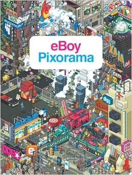 
One uses text as a book title. One makes it part of the medium and incorporates it into the illustration. Both are equally valid, but you need to choose. Edited by PixelSnader - 01 December 2014 at 9:03am |
|
|
▄▄█ ▄▄█ ▄█▄ ▄█▄ |
|
|
IP Logged |
|
|
Ego
Midshipman
Joined: 19 May 2015 Online Status: Offline Posts: 44 |
Posted: 01 December 2014 at 10:21am |
|
Good point. I suppose I can just do that :)
And no, what I meant was that I wasn't using full pieces largely, instead creating small illustrative diagrams. I do use someone else's piece at one point, but I did get their permission for it. Sorry for the unclear wording. |
|
|
IP Logged |
|
|
Ego
Midshipman
Joined: 19 May 2015 Online Status: Offline Posts: 44 |
Posted: 18 December 2014 at 12:50am |
|
Ugggggggh this project ain't dead, it's been two weeks of nonstop
schoolwork. I'm not quite through those woods yet, but I had some time
to do a little modification here and there.
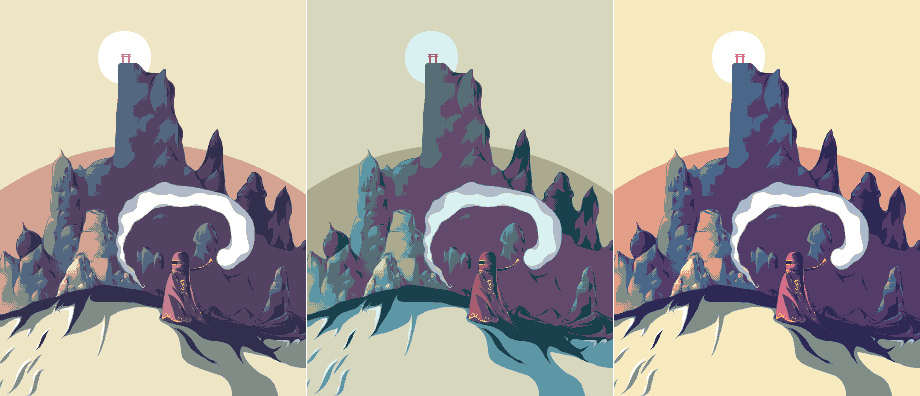 The three images are identical, with different palettes. The middle one is the same palette as the previous draft - I've included it mostly as reference, and because it's easily the bluest of the ones I've made. There might have been six or seven full palette revisions between these ones and the previous, but I eventually landed on the one on the left. That one has the most thought put into it. The one on the right had the saturation mechanically adjusted up, though it's still pretty close. My palette concerns: The neutral green I'm using bugs me some - I don't like the look of green in the image. I could probably try to transition from orange to blue on the other side of the color wheel, using a neutral purple or magenta, but I dunno, that seems like it'd make the palette TOO homogenized. This totally might be my monitor, but the darkest purple and the second-darkest purple. Does it seem like there's a weird thing going on between the two colors, like at the boundary? I can't fix it regardless of what I do, and I've seen in this in some of my other pieces, so I think it's my monitor. I noticed I had a clone color hiding after I saved this display image - it's been fixed, so I'm down to 12. That includes true white now, as well as a very lightly used AA color around the edge of the background circle (and the white on the spirit creature). That color isn't used much, but I felt I needed it to blunt the edge of the background arc. Speaking of which, there is a background arc! I vaguely thought about dithering a transition, but I actually feel pretty good about leaving it as a stark contrast. I dropped a couple colors from the mountain ramp. Additionally, I'm hoping to at least fake depth by dropping colors as I moved deeper, hoping to capture a little bit of that multi-planar thing. That works a little better with different content types on each layer, but for a first attempt it seems better at least. The main mountain spire, as well as the gate and glow at its peak, are in a heavy WIP state. I haven't really decided how I'm going to do them yet, but didn't want to leave this progress report waiting just for that. Feedback on potential ideas would be good, but the individual pixels aren't there to give feedback on yet. If you have what you think is a great idea for breaking up that solid vertical plane, I'm open to suggestions, but am also comfortable leaving it straight - I don't think it's actually that problematic as a composition element, but as I've said that's not exactly my strong suit. The figure got bolder, and a bit more detail into the robes courtesy of some highlighting that may not strictly follow the light source but looks pretty sharp. In the dunes, I've tried to just fill some space for now. I might end up leaving it in that style, or I might use that space for something more interesting. Text is absent for now. It will return later. Thanks for the help folks! |
|
|
IP Logged |
|
|
Ego
Midshipman
Joined: 19 May 2015 Online Status: Offline Posts: 44 |
Posted: 01 January 2015 at 3:37am |
|
Callin' it done I think!
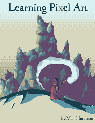
 That's what I'm going with. Or it would be, if I hadn't misjudged the dimensions of the page. Pixel-to-page is so complicated. This is the actual product: 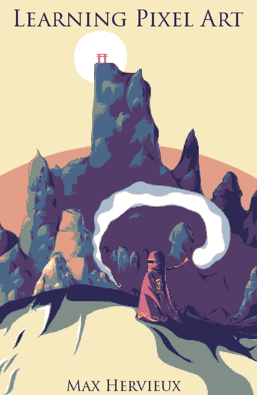 I'm working on producing a good step-by-step. Any last-minute thoughts about what has to change before I call it done and get my ass on releasing this sucker? And thanks for your help everyone. I feel pretty damn proud of this image at this point. Best I've made in a while, especially at this size. |
|
|
IP Logged |
|
|
jeremy
Rear Admiral 
Joined: 25 November 2024 Location: New Zealand Online Status: Offline Posts: 1704 |
Posted: 01 January 2015 at 4:30am |
|
It's a shame that the text isn't pixel too. There must be a decent serif pixel font out there, or at least a font you could set to no AA and clean up. Probably something more up-and-down than Trajan would be better for that.
|
|
|
IP Logged |
|
|
jeremy
Rear Admiral
Joined: 25 November 2024 Location: New Zealand Online Status: Offline Posts: 1704 |
Posted: 01 January 2015 at 4:34am |
|
similar to this maybe http://www.fonts2u.com/serif-pixel-7.font
 |
|
|
IP Logged |
|
|
jalonso
Admiral
Joined: 29 November 2022 Online Status: Offline Posts: 13537 |
Posted: 01 January 2015 at 5:20am |
|
You've done a beautiful job.
Because of the subject matter I've zoomed and reviewed every pixel as it would seem important to nitpick a lot on the pixel level. The sun has a jaggy on 4 sides where the pixels do a 2:1:2 line. Also review all the white areas on the bottom ground where it meets yellow. That's all I could find. I don't hate the NPA font but if you feel adventurous http://www.pentacom.jp/pentacom/bitfontmaker2/ |
|
|
|
|
|
IP Logged |
|
|
Ego
Midshipman
Joined: 19 May 2015 Online Status: Offline Posts: 44 |
Posted: 06 January 2015 at 1:18am |
|
Thank you very much about the fonts - I decided to switch out to a pixel font. I didn't make my own through that pentacom site (which is really really cool, thanks for showing me that!) but I used one out of their gallery that I liked. If I don't have second thoughts about it in the next couple days I'm just gonna go with it.
I fixed up the sun, and realized that the white bits in the foreground are really kinda superfluous and figured I could just axe them comfortably. Thanks for the analysis and the kind words, and to everyone through the thread for the help! 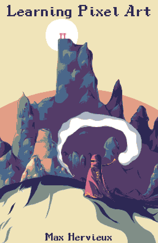 |
|
|
IP Logged |
|
|
skittle
Commander
Joined: 20 July 2021 Online Status: Offline Posts: 350 |
Posted: 06 January 2015 at 2:50am |
|
Hey, this is shaping up nicely!
A little thing that seems a bit weird, is that the viewer is taking the mountain head on, but the character is being viewed from the side. I think the composition could play out nicer if you showed the characters back only and move him to the center of the canvas imho Another option would be to move the mountain to the right of the canvas so it would line up with the robed persons vision, atm it doesn't look like he's looking at the mountain or the red gate at the top which looks to be one of the centers of attention. Not completely sure if doing that would improve this in anyway though. Keep at it! Edited by ADrawingMan - 06 January 2015 at 8:14am |
|
|
IP Logged |
|
|
jalonso
Admiral
Joined: 29 November 2022 Online Status: Offline Posts: 13537 |
Posted: 06 January 2015 at 5:11am |
|
Looks great.
* Try the author's name in the purple. * 2 white strays on the cream ground. * 1 cream stray by the 2 white ones in the grey. * On the right side edge from bottom up on first grey area 4 light blue pixels. * Next up from that the light blue area that uses pink dithered highlight the light blue line that goes down on the very edge is ugly. |
|
|
|
|
|
IP Logged |
|
|
PixelSnader
Commander
Not a troll! Joined: 21 May 2026 Online Status: Offline Posts: 3194 |
Posted: 07 January 2015 at 3:59am |
|
Your text is scaled sloppily. Some of the title 'pixels' are 4x4, some are 3x4, some 4x3 and some 3x3. A similar thing is going on with your name. Always make sure your scaled pixels are in neat 100% increments.
|
|
|
▄▄█ ▄▄█ ▄█▄ ▄█▄ |
|
|
IP Logged |
|
|
Ego
Midshipman
Joined: 19 May 2015 Online Status: Offline Posts: 44 |
Posted: 17 January 2015 at 6:05pm |
|
After a brief foray into one of my other projects, back to finish the job here!
@Snader: You're right! And I'm not entirely sure how that happened, given that I knew about it and thought I'd already fixed it! Guess I saved the wrong copy. Oh well, thank you for pointing it out! @Jalonso: Thanks, hopefully fixed up the things! The last thing you mentioned wasn't super-clear to me but I tried fiddling in that region anyway, it didn't look perfect before anyway. @ADrawingMan: Thanks! I definitely see what you mean. Unfortunately, moving stuff around like that is a looooot of work for a piece that, at this point, I just want to get done. However, what you're saying makes a lot of sense. To try to get a bit more of the sense of the path forward by tilting the character's eye-hole more forward, out of our view. Now it looks more like they're taking it more head-on, just like the viewer. At this point, unless there's anything super-critical that needs adjustment, I think I'm calling it. I'm a bit over my schedule with this project anyway - I want to get it released. Thanks for all of your help! |
|
|
IP Logged |
|
|
jalonso
Admiral
Joined: 29 November 2022 Online Status: Offline Posts: 13537 |
Posted: 17 January 2015 at 7:23pm |
|
Its beautiful.
When you're all done send in as news and a link too. |
|
|
|
|
|
IP Logged |
|
|
Ego
Midshipman
Joined: 19 May 2015 Online Status: Offline Posts: 44 |
Posted: 17 January 2015 at 7:57pm |
|
Thanks, will do!
|
|
|
IP Logged |
|
|
Limes
Commander
Joined: 15 September 2021 Online Status: Offline Posts: 683 |
Posted: 17 January 2015 at 9:44pm |
|
Will there be any section on composition?
|
|
|
|
|
|
IP Logged |
|
|
Ego
Midshipman
Joined: 19 May 2015 Online Status: Offline Posts: 44 |
Posted: 17 January 2015 at 9:50pm |
|
@Limes: No. I considered it, but decided against for three main reasons:
~ Mechanics of pixel art are a different topic from designing a piece in general. While I note that learning composition is valuable and almost key to creating great pixel art (this book will let you make good pixel art, knowing composition will let you make great any art), it's not the subject I want to tackle. Plus it's a giant topic. ~ As can be seen by how I've been humbled by folks like jtfjtfjtf in here, I am anything but an expert on composition. My skills lie in mechanics, and explaining mechanics. ~ Composition has been thoroughly examined and developed by the art community, with textbooks and classes dedicated to the subject. Composition discussion is basically as old as art, so I feel less bad about leaving it out - the resources are out there to learn composition. Thanks for the interest! |
|
|
IP Logged |
|
|
Limes
Commander
Joined: 15 September 2021 Online Status: Offline Posts: 683 |
Posted: 17 January 2015 at 10:18pm |
|
Thanks, yeah I am in grade 12 and high school composition courses are quite basic, and I prefer in person teaching as it is a lot more direct and accessible.
For now. The internet should do me fine. Edited by Limes - 17 January 2015 at 10:19pm |
|
|
|
|
|
IP Logged |
|
|
Ego
Midshipman
Joined: 19 May 2015 Online Status: Offline Posts: 44 |
Posted: 18 January 2015 at 12:38am |
|
@Limes: Oh, yeah, I can understand that. Especially in high school those classes are surface level. Of course, composition is really arcane in general, so that doesn't help.
I'm sure there are some more direct texts out there, but I'm not an expert. However, numerous folks here and on Pixelation are fully-trained artists and would know where to point you! Ask about around here (the Resources forum probably) or Pixelation (wayofthepixel.net, try the General & Creativity forum) and I'm sure someone can point you in the direction of a more straightforward and accessible composition document. I can't imagine in the long history of composition studies there isn't one for what you're looking for. If you do find one, report back please, I'd love to read one as well! |
|
|
IP Logged |
|
| |
||
Forum Jump |
You cannot post new topics in this forum You cannot reply to topics in this forum You cannot delete your posts in this forum You cannot edit your posts in this forum You cannot create polls in this forum You cannot vote in polls in this forum |
|
