| Active TopicsSearchRegisterLogin |
| WIP (Work In Progress) | |
| |
  |
| Author | Message |
|
SuperPanda
Commander 
Joined: 04 June 2026 Online Status: Offline Posts: 102 |
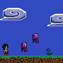
  Topic: Platform scene C+C please Topic: Platform scene C+C pleasePosted: 05 October 2009 at 6:17pm |
|
I i'm just making this scene as a kind of demo for my adventure into platform games. I have almost no experience in doing backdrops so i need suggestions for that also as well as anything else you can see that needs fixing. Thanks allot =)
 |
|
 IP Logged IP Logged |
|
|
jalonso
Admiral 
Joined: 29 November 2022 Online Status: Offline Posts: 13537 |
Posted: 05 October 2009 at 7:19pm |
|
Blues are far too dark to make things look nice...even if its a night scene.
True greys on the clouds are so boring. Consider desaturated blues instead. Edited by jalonso - 05 October 2009 at 7:36pm |
|
|
|
|
|
IP Logged |
|
|
SuperPanda
Commander
Joined: 04 June 2026 Online Status: Offline Posts: 102 |
Posted: 06 October 2009 at 6:44am |
|
Thanks for the critique jalanso. I took everything you said into consideration make a big improvement on the clouds =). I need some advice for a backdrop and also can someone critique the platfrom with the grass and rocks. Thanks again i appreciate the help. here's updated image
 Edit (I tried throwing in a back drop)  Edited by SuperPanda - 06 October 2009 at 7:31am |
|
|
IP Logged |
|
|
Jakten
Seaman 
Joined: 05 January 2015 Location: Canada Online Status: Offline Posts: 12 |
Posted: 06 October 2009 at 10:28am |
|
I really like the main character
The clouds seem way too dark now. The majority of a cloud is a light colour (unless it is about to rain). As for the backdrop, the river is kind of an eye catcher. you want people to focus on whats happening in the foreground. This means the forground should be detailed and vibrant while the background is less detailed and a bit more desaturated.  As things move back in space they start to gain a lot of sky colour and less of their own. Notice how the back mountains are basically one colour with no inner details. I think if you lighten up the mountains in the background to be lighter than the grass (but not lighter than the sky) in the back ground it might look better. As for the river in the back ground, maybe make it a bit more green and less saturated. Your grass kind of looks like slime in the foreground. Hopefully this helps lol, I look forward to your next update! < id="gwProxy" ="">< ="jsCall();" id="jsProxy" =""> |
|
|
IP Logged |
|
|
SuperPanda
Commander
Joined: 04 June 2026 Online Status: Offline Posts: 102 |
Posted: 06 October 2009 at 2:35pm |
|
Thanks for the critique jakten. I tried taking into consideration all your advice Here's how it came out. I tried to make the grass look more like grass. and i added the mountains. I'm still stumped on the middle grassy area.
 |
|
|
IP Logged |
|
|
Manupix
Commander
Joined: 07 May 2026 Online Status: Offline Posts: 771 |
Posted: 06 October 2009 at 3:20pm |
|
You have a main perspective issue.
The foreground is shown exactly from ground level, so the horizon must be at the same level too, and you can't see any plain or river. Only distant things higher than the horizon such as mountains can be seen. Alternatively, you can choose a higher point of view, and have the plain and river, but in this case the trees and chars can't be seen on edge, they must move somewhat back. This second option is more difficult. See this gallery, there are examples of both; and search more platform games on PJ. Whichever you choose, try to take better care of your composition: the horizon in the middle is not the best choice (1/3 or 2/3 of the height is a good rule of thumb, although other choices can be great too), and the top of the trees are at just that level: looks flat. Try to fix these general issues before going into detail such as grass. The main char looks quite good! |
|
|
IP Logged |
|
|
Hatch
Admiral
Joined: 05 August 2015 Online Status: Offline Posts: 1387 |
Posted: 06 October 2009 at 3:43pm |
|
I dunno, I think I've seen that particular mangling of perspective in platformers a lot. I'd say that's something that's OK to cheat. I would definitely move the horizon line down, though.
Also, for your cube-like enemies, I would remove the internal black outlines. With such an obvious cube shape to work with, really accentuate the planes to the max! You can define the shape completely with shading; the black lines are redundant and distracting. |
|
|
IP Logged |
|
|
SuperPanda
Commander
Joined: 04 June 2026 Online Status: Offline Posts: 102 |
Posted: 06 October 2009 at 5:16pm |
|
Thanks for the critique on perspective manupix I took your advice and lowered the horizon. Thanks Hatch for the help on the flying squishy cube.
Here's results and thanks again guys for your input its appreciated.  Edited by SuperPanda - 06 October 2009 at 5:16pm |
|
|
IP Logged |
|
|
jalonso
Admiral
Joined: 29 November 2022 Online Status: Offline Posts: 13537 |
Posted: 06 October 2009 at 7:08pm |
|
Much improved! Keep going!
You could use the yellow color in the flower to highlight the snake and even the grass a little. Bring some of the flowers darkest 2 reds into the rocks could work too. |
|
|
|
|
|
IP Logged |
|
|
SuperPanda
Commander
Joined: 04 June 2026 Online Status: Offline Posts: 102 |
Posted: 07 October 2009 at 5:31am |
|
thanks jalonso i tried the red in the rocks and the yellow a little for the grass.
 |
|
|
IP Logged |
|
|
Hatch
Admiral
Joined: 05 August 2015 Online Status: Offline Posts: 1387 |
Posted: 07 October 2009 at 6:09am |
|
I think the clouds look too solid (also a bit messy). Why not clean up he lines a bit and use just one color for nice, wispy spirals, like so:

Even if you don't dig that style, you should still clean them up. |
|
|
IP Logged |
|
|
SuperPanda
Commander
Joined: 04 June 2026 Online Status: Offline Posts: 102 |
Posted: 07 October 2009 at 6:55am |
|
I love the edit on the clouds. it keeps the original style and still looks nice. Do you think i should work on the grass more? or is there anything else that needs work? Once i get the piece done i want to try and add it to the gallery.
|
|
|
IP Logged |
|
|
Di0xygen
Commander
Joined: 03 July 2005 Online Status: Offline Posts: 401 |
Posted: 07 October 2009 at 8:16am |
|
I did a small edit to the trees, cause i think its one of the weakest part in your mockup.
feel free to tell me its a crap edit :P  |
|
|
c==3
|
|
|
IP Logged |
|
|
jalonso
Admiral
Joined: 29 November 2022 Online Status: Offline Posts: 13537 |
Posted: 07 October 2009 at 8:37am |
|
In case you don't know:
When edits are made to your pixels they are to show you ways to illustrate only and you can't use them. You need to make it all yourself. Focus on 'cleaning' your piece which is what Hatch and DiOxygen have basically done. The mountains have sloppy areas, clean those up. The snake could use the lightest blue from the pants where you had orange before. You have been trying hard enough that I don't see why this won't end up in your gallery. You are doing good, Keep going. |
|
|
|
|
|
IP Logged |
|
|
SuperPanda
Commander
Joined: 04 June 2026 Online Status: Offline Posts: 102 |
Posted: 07 October 2009 at 10:19am |
|
Thank Di0xygen and jalonso. I think will most likely be the finished version unless anyone can see anything else that really stuck out bad. (I changed the snake to match the pink squid cubes color)
 |
|
|
IP Logged |
|
|
Manupix
Commander
Joined: 07 May 2026 Online Status: Offline Posts: 771 |
Posted: 07 October 2009 at 11:56am |
|
Better, but not there yet! ;)
The former squid was much, much better... and both have a problem: the left and center tentacles are shifted on the same line, which is now also a line in the mountain: looks terrible! (hope that was clear) The snake has improved but still looks strange, head is too flat, and it's thick around the tree. Lost his tongue too... Trees are better, but the trunks could improve. And the dark green ground/horizon line is very distracting, try to break it. |
|
|
IP Logged |
|
|
SuperPanda
Commander
Joined: 04 June 2026 Online Status: Offline Posts: 102 |
Posted: 07 October 2009 at 3:36pm |
|
Thanks again manupix for the critiques. I tried changing the squid back more to the style that was better. I worked on the trunk and fixed the line across the grass. here's the edit
 |
|
|
IP Logged |
|
|
jalonso
Admiral
Joined: 29 November 2022 Online Status: Offline Posts: 13537 |
Posted: 07 October 2009 at 3:59pm |
|
You are truly doing a great job of taking other's opinions to make your piece better and better with each update.
I think there is more you can still and will not say anything specific to let you be self-critical and perhaps find things to improve... ...keep going. |
|
|
|
|
|
IP Logged |
|
|
Manupix
Commander
Joined: 07 May 2026 Online Status: Offline Posts: 771 |
Posted: 07 October 2009 at 4:05pm |
|
Agree! Well done so far! 8D
|
|
|
IP Logged |
|
|
Club Beuker
Commander
Joined: 29 January 2007 Online Status: Offline Posts: 513 |
Posted: 08 October 2009 at 1:43am |
|
Starts to look real great. Maybe a slight hint (you don't have to do this) But to create some more depth you can lower your saturation (if I'm correct) of the tree.
|
|
|
Without me, it's just aweso
|
|
|
IP Logged |
|
|
SuperPanda
Commander
Joined: 04 June 2026 Online Status: Offline Posts: 102 |
Posted: 08 October 2009 at 1:46pm |
|
Originally posted by Club Beuker Starts to look real great. Maybe a slight hint (you don't have to do this) But to create some more depth you can lower your saturation (if I'm correct) of the tree. thanks for the critigue beuker and everyone else for your help. i switched the palette to one with restriction for snes. I touched up the tree i touched up the stones tried to make em pop more. And i changed the color for pretty much everything. I did this because i'm awful at selecting colors and i can waste hours and still not do it right. Heres the edit.  |
|
|
IP Logged |
|
|
Zeratanus
Commander
Joined: 03 December 2020 Online Status: Offline Posts: 576 |
Posted: 08 October 2009 at 1:52pm |
|
Personally I'd love to see some colored outlines on the boy and the snake. Black is fine for the hair and all, but compared to the ground, background, tree, cubesquidthing, and flower I think they'd both fit in more and look overall better with colored outlines, especially on the boys shorts, to break up all the black in that area.
Also maybe put the trees either behind the grass that comes up? I assume at least the left one is in the background and not directly in his walking path, so putting it behind that would make that easier to see. |
|
|
IP Logged |
|
|
Hatch
Admiral
Joined: 05 August 2015 Online Status: Offline Posts: 1387 |
Posted: 08 October 2009 at 1:52pm |
|
Tree, grass, rocks, color, everything looks much better. Looking at it as a game, though, I'd be confused about whether or not I could pass either tree or if I'd have to find a way over them (especially the tree with the enemy attached to it--very confusing). Also, the flower seems too in-fronty. I think maybe removing the outline would make it seem more like a background element. It's also lost it's central yellow area in the color update, which makes it lose much of its flowerness.
|
|
|
IP Logged |
|
|
SuperPanda
Commander
Joined: 04 June 2026 Online Status: Offline Posts: 102 |
Posted: 08 October 2009 at 3:51pm |
|
@zeratanus I tried fixing the outlines and made the tree fit more into the background
@ hatch I removed the flower it was kind of an eye sore and replaced it with flowers that fit into the background better i think. I'm still having trouble adding depth to the snake but its better than when i first started so i'm happy with that. Thanks again guys for your help =) heres the edit.  |
|
|
IP Logged |
|
|
linx
Commander
Joined: 19 January 2009 Online Status: Offline Posts: 124 |
Posted: 08 October 2009 at 3:57pm |
|
The progress on this piece is amazing. The only part i dont like about it, is that squishy enemy :P. Everytime i look at this it always looks sort of random. (A block squid thing)
Edited by linx - 08 October 2009 at 3:57pm |
|
|
IP Logged |
|
|
SuperPanda
Commander
Joined: 04 June 2026 Online Status: Offline Posts: 102 |
Posted: 08 October 2009 at 6:45pm |
|
yea it is kinda random but so am i :P. Maybe i'll make a different enemy if anyone has any good ideas for one. the block squid was inspired by these cute enemies i saw ilke made(spelled his name wrong)
|
|
|
IP Logged |
|
|
Club Beuker
Commander
Joined: 29 January 2007 Online Status: Offline Posts: 513 |
Posted: 09 October 2009 at 12:50am |
|
Another detail:
Give the middle arm of the squid the same color as the outline. It'll give more depth... It's all about depth doc!! (sorry for that) |
|
|
Without me, it's just aweso
|
|
|
IP Logged |
|
|
jalonso
Admiral
Joined: 29 November 2022 Online Status: Offline Posts: 13537 |
Posted: 09 October 2009 at 1:12pm |
|
I am taking your art to show something and will post later.
*hours later...* The image below shows a process that takes time and patience and I worked quickly because I simply wanted to illustrate what words alone simply can't. You can and SHOULD take your time and be patient with your pixels. I will return later with another similar 'quickie' dealing with layout and composition :)  |
|
|
|
|
|
IP Logged |
|
|
Manupix
Commander
Joined: 07 May 2026 Online Status: Offline Posts: 771 |
Posted: 09 October 2009 at 3:51pm |
|
Major tutorial underway!
This is something I just never do, yet: I'm all eyes! Thanxxxx... |
|
|
IP Logged |
|
|
SuperPanda
Commander
Joined: 04 June 2026 Online Status: Offline Posts: 102 |
Posted: 09 October 2009 at 4:20pm |
|
WOW ! that tutorial is awesome jalonso. How did you find those stray pixel in your grey picture? I would love to know how to do that. I used the techniques in that tutorial to try and slim down the colors i'm using. So far i got down to 32. And the reason it's 32 is because i can't find those stray pixels. I just cant seem to find them by eye balling it.
Well here's the edit, and let me just say i never thought i would be able to make my piece this much better in such a short period of time. Thanks to everyone here it's turned out good and i learned allot more. I still need to work on anti aliasing because i'm not that good at it. Here's the edit.  I booked mark this page for the awesome tutorial. I never knew about how to create a palette. |
|
|
IP Logged |
|
|
Hatch
Admiral
Joined: 05 August 2015 Online Status: Offline Posts: 1387 |
Posted: 09 October 2009 at 6:19pm |
|
I dunno, the blue in the grass seems really out of place to me, in both your and jal's edit. How about something like this:
 I actually think the blue works well on the silhouettes of grass poking up (better than the brown in my edit), but on the clumps hanging down it looks odd. |
|
|
IP Logged |
|
|
jalonso
Admiral
Joined: 29 November 2022 Online Status: Offline Posts: 13537 |
Posted: 09 October 2009 at 8:41pm |
|
@Hatch, thx for pointing that out :) I am just quickly throwing things in to illustrate points. I have a gazillion errors that I don't think are critical since Panda has to pixel everything himself and I hope he catches these things own his own.
@Panda, So... Here is another image showing some things for you to think about. All my images have flaws so take these things only as advice and general idea type of thing and not as an illustration of perfection or the only way/solution. This is just my help for you because every so often someone posts a WIP and is willing to put the effort into it. Its important that you know that I would have added your art several edits ago but because you seem willing to improve I'm trying to help you whip this baby to the ground. While its very nice to remove colors whenever possible its cool to add too. In the last edit I think adding colors just for the snake would be nice.  E: To your previous question about finding stray pixels and colors. I use Photoshop and therefore I just use the 'wand' tool. I don't know PC programs (I'm starting to learn). Maybe someone else knows how. DeProgrammer made his own app, something about colors...dunno really on this question. +1E: The reason I think sometimes starting over is best is because at a certain point things become clear and its far easier, for me at least, to just think of all the previous work as a ref., and not a waste of time in any way. +2E: I've hated the very pointy Hershey kisses mountains you had going and just couldn't bring myself to placing those in the very last remake. I would add new colors for the snake and the flowers here... Don't take what I or anyone else says as as law. Its just help for you to figure things out yourself. Take what you need ignore what you don't. Its just art discussions, k. Edited by jalonso - 09 October 2009 at 9:37pm |
|
|
|
|
|
IP Logged |
|
|
SuperPanda
Commander
Joined: 04 June 2026 Online Status: Offline Posts: 102 |
Posted: 10 October 2009 at 2:00pm |
|
Thanks jalonso for the tutorial. What i did Was add a background. I too didn't like the pointy mountains that much either and considered changing them at one point.( i think they look better rounded). This might not be the finished one but i can hopefully take what i learned in this and apply it to other works i do =). Thanks again for your time to edit i'm learning allot about backgrounds and palettes. and PA in general. He's the edit (I didn't start from scratch yet but if i do i should make it in layers right? the background first then add the sprites?
Here's the update with the back ground. I apologize if it looks so similar to your edit i tried adding my own style to it , thanks again  |
|
|
IP Logged |
|
|
jalonso
Admiral
Joined: 29 November 2022 Online Status: Offline Posts: 13537 |
Posted: 10 October 2009 at 2:06pm |
|
You've gone a great job. So long as you've learned and carry it forward my time was not wasted :)
I like working in layers because I can always move stuff around with ease. Its a personal choice. Working back to front or front to back is also a personal choice. I like front to back so that I only pixel what is seen and shows and nothing else. ps: when you submit to your gallery you should consider linking to this thread so others can freeload info and so that viewers can see how hard you worked on your piece. > > >
Edited by jalonso - 10 October 2009 at 2:09pm |
|
|
|
|
|
IP Logged |
|
|
Di0xygen
Commander
Joined: 03 July 2005 Online Status: Offline Posts: 401 |
Posted: 10 October 2009 at 7:52pm |
|
That is a really incredible improvement.. it seems these 2 things have been done years apart, you still have a lot to learn but you seem to understand what to improve at tremendous rate.. it's incredible
wow just wow |
|
|
c==3
|
|
|
IP Logged |
|
|
SuperPanda
Commander
Joined: 04 June 2026 Online Status: Offline Posts: 102 |
Posted: 11 October 2009 at 7:17am |
|
I keep trying to submit it as a detailed image because its over 100X100 and i get this error.
Error! There was a problem processing your request. Please correct the following:
|
|
|
IP Logged |
|
|
Zeratanus
Commander
Joined: 03 December 2020 Online Status: Offline Posts: 576 |
Posted: 11 October 2009 at 7:42am |
|
You need both a small image and a large image. the small image is used for the thumbnail in the gallery. Anyway, the snake's head kinda gets lost with the background, but great improvement there
|
|
|
IP Logged |
|
|
jalonso
Admiral
Joined: 29 November 2022 Online Status: Offline Posts: 13537 |
Posted: 11 October 2009 at 10:49am |

|
|
|
|
|
|
IP Logged |
|
| |
||
Forum Jump |
You cannot post new topics in this forum You cannot reply to topics in this forum You cannot delete your posts in this forum You cannot edit your posts in this forum You cannot create polls in this forum You cannot vote in polls in this forum |
|
