| Active TopicsSearchRegisterLogin |
| Collaborations/Challenges | |
| |
  |
| Author | Message |
|
administrator
Admiral 
Joined: 03 March 2005 Online Status: Offline Posts: 0 |
  Topic: CHALLENGE 6/30/2008: Pixel-graphy Topic: CHALLENGE 6/30/2008: Pixel-graphyPosted: 30 June 2008 at 2:59am |
CHALLENGE: Pixel-graphyStickman challenges you to think pixel fonts from the pixel artist perspective.Not as single color bitmaps, but using pixelart techniques to create your typeface. So, pixel the numbers 0 - 9 and the alphabet in either UPPERCASE or lowercase (or both if you're feeling adventurous and have time) in your own creative way. Colours: More than 2 (excludes transparency) but less than 32 colors. Canvas Size: No real restrictions, but this is not for newspaper 'war' headlines, k. Transparency: Allowed SPECIAL NOTE: No external AA. CHALLENGE RULES
CHALLENGE JUDGING
CHALLENGE PRIZES/GOODIES
CHALLENGE VOTINGVote now for your favorite pixelart in this week's challenge!CHALLENGE AWARDSThe Pixel-graphy pixel art challenge is complete and we have three new champions. This week's challenge awards go to the following pieces:Thanks so much to all who took the time to vote and participate in the challenge!  abc... by juandifool abc... by juandifool |
|
 IP Logged IP Logged |
|
|
balls01
Seaman 
Joined: 02 May 2015 Online Status: Offline Posts: 27 |
Posted: 30 June 2008 at 3:45am |
|
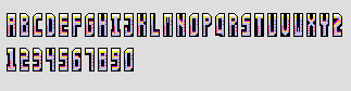
simple for me im a pro at my legendary HP font hold on ill just put it up
were meant to do evfery letter... doesnt really go well for this font because its meant to be played with and any shape with 4 directions in a shape of a letter is it. 
oficially wip now Edited by balls01 - 30 June 2008 at 4:45am |
|

|
|
|
IP Logged |
|
|
JerryPie
Rear Admiral 
Joined: 01 October 2024 Online Status: Offline Posts: 232 |
Posted: 30 June 2008 at 6:15am |
|
The point of a font sheet is to work well together. These letters only go fit with the one in front and behind it on the alphabet. This would not work at all if you had to re-arrange to spell something.
|
|
|
IP Logged |
|
|
skamocore
Admiral
Joined: 07 April 2021 Online Status: Offline Posts: 3866 |
Posted: 30 June 2008 at 11:34am |
 hrm. Might try another set... |
|
|
IP Logged |
|
|
lap1994
Seaman
Joined: 22 May 2008 Online Status: Offline Posts: 22 |
Posted: 30 June 2008 at 3:28pm |
|
Cool! I was going to make a font set for my game.
I will post here the WIP. Cya. PS: Normal fonts must have ASCII chars from 33 to 126 plus special non-printable chars 32(space) and 127(line break). ASCII 33 to 126: !"#$%&'()*+,-./0123456789:;<=>?@ABCDEFGHIJKLMNOPQRSTUVWXYZ[\]^_`abcdefghijklmnopqrstuvwxyz{|}~ |
|
|
IP Logged |
|
|
lap1994
Seaman
Joined: 22 May 2008 Online Status: Offline Posts: 22 |
Posted: 30 June 2008 at 3:39pm |
|
Sorry for double posting.
May I post multiples submissions for a challenge? |
|
|
IP Logged |
|
|
Talos
Midshipman 
Joined: 24 January 2008 Location: Canada Online Status: Offline Posts: 47 |
Posted: 30 June 2008 at 5:15pm |
|
I'd assume so, seeing as jal has done it.
|
|
|
IP Logged |
|
|
lap1994
Seaman
Joined: 22 May 2008 Online Status: Offline Posts: 22 |
Posted: 30 June 2008 at 5:33pm |
|
I am going to post one font per day till I get that ribbon or I broke my mouse :P
|
|
|
IP Logged |
|
|
Talos
Midshipman
Joined: 24 January 2008 Location: Canada Online Status: Offline Posts: 47 |
Posted: 30 June 2008 at 5:54pm |
 This's what I got for now. need C+C before finishing.
|
|
|
IP Logged |
|
|
lap1994
Seaman
Joined: 22 May 2008 Online Status: Offline Posts: 22 |
Posted: 30 June 2008 at 6:41pm |
|
OMG! I sux even in font drawing! I will try again tommorrow. oO'
|
|
|
IP Logged |
|
|
balls01
Seaman
Joined: 02 May 2015 Online Status: Offline Posts: 27 |
Posted: 01 July 2008 at 1:45am |
|
Originally posted by FlyGuy
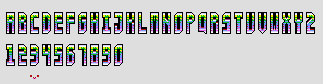
The point of a font sheet is to work well together. These letters only go fit with the one in front and behind it on the alphabet. This would not work at all if you had to re-arrange to spell something. yeah true my font isnt really set for an actual font... but yet again the rules dont state that it has to flow smoothly as an actual font am i not correct, it only says make a font Edited by balls01 - 01 July 2008 at 1:52am |
|
|
|
|
|
IP Logged |
|
|
grave
Commander 
Joined: 27 November 2019 Online Status: Offline Posts: 127 |
Posted: 01 July 2008 at 3:27am |
|
Ive made two fonts (one completely and on one just afew letter) very rescently and ive thought about making another one. So I will probably enter :)
|
|
|
IP Logged |
|
|
JerryPie
Rear Admiral
Joined: 01 October 2024 Online Status: Offline Posts: 232 |
Posted: 01 July 2008 at 7:54am |
|
Originally posted by balls01 Originally posted by FlyGuy
The point of a font sheet is to work well together. These letters only go fit with the one in front and behind it on the alphabet. This would not work at all if you had to re-arrange to spell something. yeah true my font isnt really set for an actual font... but yet again the rules dont state that it has to flow smoothly as an actual font am i not correct, it only says make a font Usually people enter a competition to win. If you want to win it might be better to make a font. If you actually think about the word font, you would assume that it would merge together nicely. |
|
|
IP Logged |
|
|
skamocore
Admiral
Joined: 07 April 2021 Online Status: Offline Posts: 3866 |
Posted: 01 July 2008 at 11:19am |
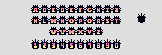
 hmm...I think I'm nearly done? |
|
|
IP Logged |
|
|
Ndsfreak
Seaman
Joined: 13 May 2008 Location: United States Online Status: Offline Posts: 6 |
Posted: 01 July 2008 at 1:59pm |
|
I can't decide which one of these to enter.
Help me decide, please. |
|
|
IP Logged |
|
|
jamcob
Seaman
Joined: 14 December 2017 Online Status: Offline Posts: 29 |
Posted: 01 July 2008 at 2:39pm |
|
What would be interesting is a font with animation, seen as its not against the rules.
Ndsfreak, id go with the first one, i dont really like the bigger one. The first one is more "pixel" to me.
I've dicided not to enter this as i suck, but i got some ideas for anyone whos stuck.
Isco font
moving font
font on small pixel guys t shirts
tree shaped font
but i guess no one will really be stuck as you can do anything, oh wellz  Edited by jamcob - 01 July 2008 at 2:51pm |
|
|
IP Logged |
|
|
balls01
Seaman
Joined: 02 May 2015 Online Status: Offline Posts: 27 |
Posted: 02 July 2008 at 2:11am |
|
Originally posted by FlyGuy
[QUOTE=balls01] [QUOTE=FlyGuy] The point of a font sheet is to work well together. These letters only go fit with the one in front and behind it on the alphabet. This would not work at all if you had to re-arrange to spell something. maybe i am entering to win maybe im entering to give sumthing to the community to block it some more well as its not in the rules i dont see why mine isnt as much of a challenge as any one elses its still a font... it does go smoothly just have to be put in order Edited by balls01 - 02 July 2008 at 2:13am |
|
|
|
|
|
IP Logged |
|
|
jamcob
Seaman
Joined: 14 December 2017 Online Status: Offline Posts: 29 |
Posted: 02 July 2008 at 10:04am |
|
balls01, its a nice font and its not against the rules. FlyGuy has a good point but as these arent going to be used as a font (most likely), so no one should care. Go for it
|
|
|
IP Logged |
|
|
lap1994
Seaman
Joined: 22 May 2008 Online Status: Offline Posts: 22 |
Posted: 02 July 2008 at 11:05am |
|
Wait! I thought we could post multiple images for a challenge. Therefore, you could post both, right?
PS: What do you think about this font/WIP?  Edited by lap1994 - 02 July 2008 at 11:13am |
|
|
IP Logged |
|
|
skamocore
Admiral
Joined: 07 April 2021 Online Status: Offline Posts: 3866 |
Posted: 02 July 2008 at 12:56pm |
|
another:
 |
|
|
IP Logged |
|
|
lap1994
Seaman
Joined: 22 May 2008 Online Status: Offline Posts: 22 |
Posted: 02 July 2008 at 1:13pm |
|
Can I post a font with ASCII from 33 to 126?
!"#$%&'()*+,-./0123456789:;<=>?@ABCDEFGHIJKLMNOPQRSTUVWXYZ[\]^_`abcdefghijklmnopqrstuvwxyz{|}~ |
|
|
IP Logged |
|
|
Hapiel
Rear Admiral
Joined: 30 June 2023 Online Status: Offline Posts: 3266 |
Posted: 02 July 2008 at 2:16pm |
|
Doing more chars can never be wrong.
Skamo: Your second lettertype looks really awesome! |
|
|
IP Logged |
|
|
Carefree Games
Seaman
Joined: 28 June 2008 Location: United States Online Status: Offline Posts: 2 |
Posted: 02 July 2008 at 7:53pm |
|
You can enter more than one font right? Just making sure before I go ahead and do it. lap1994's is the best I've seen.
Edited by Carefree Games - 02 July 2008 at 7:54pm |
|
|
IP Logged |
|
|
jalonso
Admiral
Joined: 29 November 2022 Online Status: Offline Posts: 13537 |
Posted: 02 July 2008 at 8:27pm |
|
Originally posted by Talos I'd assume so, seeing as jal has done it. hell, pain has won 1st + 2nd in the same week...pixel on. |
|
|
|
|
|
IP Logged |
|
|
Carefree Games
Seaman
Joined: 28 June 2008 Location: United States Online Status: Offline Posts: 2 |
Posted: 02 July 2008 at 8:33pm |
|
I don't know how I missed that. I read everything else instead!

|
|
|
IP Logged |
|
|
skamocore
Admiral
Joined: 07 April 2021 Online Status: Offline Posts: 3866 |
Posted: 02 July 2008 at 8:44pm |
|
I guess it would be a good idea to add that you can enter multiple times on challenge threads in the future...since there's always someone asking.
|
|
|
IP Logged |
|
|
greenraven
Commander
Joined: 08 September 2016 Online Status: Offline Posts: 2598 |
Posted: 03 July 2008 at 8:28am |
|
Originally posted by lap1994 Sorry for double posting. May I post multiples submissions for a challenge? Yes you can make as many entries as you want. For most challenges it's a bad idea since you'll be strapped for time. But this is the kind of challenge where you can easily sneak in a dozen entries or so. Speaking of which... it's been far too long since I've entered a challenge. This seems like the sort of thing that's just right for getting back into the pixeling groove.  edit: Originally posted by jalonso Originally posted by Talos I'd assume so, seeing as jal has done it. hell, pain has won 1st + 2nd in the same week...pixel on. Let's not forget Met's mad pixel spree that one challenge. How many ribbons did he get? 9? 10?  Edited by greenraven - 03 July 2008 at 8:30am |
|
 "pwnage comes with patience, practice and planning." ~ Jalonso "pwnage comes with patience, practice and planning." ~ Jalonso 
|
|
|
IP Logged |
|
|
Blueberry_pie
Rear Admiral
Joined: 24 July 2015 Online Status: Offline Posts: 2176 |
Posted: 03 July 2008 at 10:02am |
|
Don't think I'll be finishing and submitting this, but maybe it will inspire someone
  |
|
|
IP Logged |
|
|
Larwick
Commander
Joined: 18 July 2024 Online Status: Offline Posts: 4015 |
Posted: 03 July 2008 at 10:07am |
|
Thats nice and solid BP. I like the Q especially, having more pizzazz.
|
|
 
|
|
|
IP Logged |
|
|
tuaarita
Commander
Joined: 04 December 2015 Online Status: Offline Posts: 1049 |
Posted: 03 July 2008 at 11:27am |
|
Do "Ä" and "Ö" for universalityivishnessyishness.
|
|
|
I'm running in the desert,
running in to the sun, running out of blood and I'm going numb. |
|
|
IP Logged |
|
|
orbofwisdom
Commander
Joined: 15 December 2005 Online Status: Offline Posts: 299 |
Posted: 03 July 2008 at 3:25pm |
|
http://pixeljoint.com/pixelart/33699.htm blargh its my font. Edited by orbofwisdom - 04 July 2008 at 10:57pm |
|

|
|
|
IP Logged |
|
|
zi-double
Commander
Joined: 05 October 2021 Online Status: Offline Posts: 277 |
Posted: 04 July 2008 at 4:11am |
|
One question ... can somebody clear what is exactly "No
external AA." in the font !!!
|
|
|
IP Logged |
|
|
Hapiel
Rear Admiral
Joined: 30 June 2023 Online Status: Offline Posts: 3266 |
Posted: 04 July 2008 at 4:48am |
|
Hi Zi, none of your letters have AA.
The no outer AA rule is so letters will look nice on every background.. EXAMPLE:  You see? The lower image looks better on the white background but worse no the black one. To avoid this you are just not allowed to use AA on the outside of the image. If your letters look fine on every background (maybe they are not very readable on some but that doesn't matter that much) than you are most likely following the rules. AA itself is this:  |
|
|
IP Logged |
|
|
zi-double
Commander
Joined: 05 October 2021 Online Status: Offline Posts: 277 |
Posted: 04 July 2008 at 5:56am |
|
yep you are right, but somebody can say that I have 3 colours for
outline - they are in dark area and use them partially to show thin or
thick parts only ...
OK I'll continue with letters and hope to finish them in this weekend. Hope to look fun, but they aren't be so usefull 
Edited by zi-double - 04 July 2008 at 5:57am |
|
|
IP Logged |
|
|
cantdoright
Seaman
Joined: 02 July 2008 Online Status: Offline Posts: 36 |
Posted: 04 July 2008 at 2:04pm |
|
IP Logged |
|
|
purpletree
Commander
Joined: 28 December 2007 Location: Belgium Online Status: Offline Posts: 151 |
Posted: 04 July 2008 at 4:33pm |
|
very wipppy i have a WIP thing going in the other forum, c & c is welcome but there's really nothing much to comment on as its only a random two coloured thing....
 Edited by purpletree - 04 July 2008 at 4:33pm |
|
|
IP Logged |
|
|
Fuzzyleaves
Commander
Joined: 23 June 2007 Online Status: Offline Posts: 147 |
Posted: 04 July 2008 at 9:08pm |
|
most amazing idea ever purpletree!
|
|
|
<a href = "http://www.nitrome.com" > <img src = "http://www.nitrome.com/images/links/nitrome2_button.gif" width="88" height="31"/></a>
|
|
|
IP Logged |
|
|
old_flick
Midshipman
Joined: 02 March 2008 Online Status: Offline Posts: 20 |
Posted: 04 July 2008 at 9:51pm |
|
A couple finished ones, and an unfinished one that I'll finish tomorrow. I'm tired...
   |
|
|
IP Logged |
|
|
skamocore
Admiral
Joined: 07 April 2021 Online Status: Offline Posts: 3866 |
Posted: 05 July 2008 at 12:45pm |
 well someone had to do a tree font...I'm not sure if I'll even finish it...maybe I'll finish and submit later |
|
|
IP Logged |
|
|
cantdoright
Seaman
Joined: 02 July 2008 Online Status: Offline Posts: 36 |
Posted: 05 July 2008 at 1:12pm |
|
Is that an A or just what all the tree will look like before you turn them into the letters?
|
|
|
IP Logged |
|
|
skamocore
Admiral
Joined: 07 April 2021 Online Status: Offline Posts: 3866 |
Posted: 05 July 2008 at 1:16pm |
|
D: lol it's actually a B...I guess I might need to work on the readability
|
|
|
IP Logged |
|
|
Pixelarg
Midshipman
Joined: 14 April 2016 Online Status: Offline Posts: 41 |
Posted: 05 July 2008 at 7:22pm |
|
i finish my font ^^:
http://pixeljoint.com/pixelart/33719.htm |
|
|
IP Logged |
|
|
pixelblink
Commander
Joined: 19 February 2023 Online Status: Offline Posts: 2865 |
Posted: 05 July 2008 at 10:19pm |
|
started out as just for fun and I doubt I'd even finish in time since I only started a couple of hours ago and this is all I have but, I present to you: The Legion of SuperFonts!
 |
|
|
IP Logged |
|
|
cantdoright
Seaman
Joined: 02 July 2008 Online Status: Offline Posts: 36 |
Posted: 06 July 2008 at 12:09am |
|
Originally posted by pixelblink
very original!
|
|
|
IP Logged |
|
|
pixelblink
Commander
Joined: 19 February 2023 Online Status: Offline Posts: 2865 |
Posted: 06 July 2008 at 1:25pm |
|
another hour put in:
 alot of placeholders so don't comment on the truly unfinished ones |
|
|
IP Logged |
|
|
Hapiel
Rear Admiral
Joined: 30 June 2023 Online Status: Offline Posts: 3266 |
Posted: 06 July 2008 at 1:45pm |
|
Its one of the most unreadable fonts I have ever seen, but its soooo cooool you HAVE to finish it, or at least submit the letters you DID finish on PJ
|
|
|
IP Logged |
|
|
Larwick
Commander
Joined: 18 July 2024 Online Status: Offline Posts: 4015 |
Posted: 06 July 2008 at 1:46pm |
|
Nice stuff blink! Upon first quick look, i think the F-man's chin should be smaller, and maybe a lighter hair colour? Grey could work. Keep it up. :)
|
|
|
|
|
|
IP Logged |
|
|
pixelblink
Commander
Joined: 19 February 2023 Online Status: Offline Posts: 2865 |
Posted: 06 July 2008 at 2:04pm |
|
Originally posted by Lollige Its one of the most unreadable fonts I have ever seen, but its soooo cooool you HAVE to finish it, or at least submit the letters you DID finish on PJ haha... they are and I will Originally posted by Larwick Nice stuff blink! Upon first quick look, i think the F-man's chin should be smaller, and maybe a lighter hair colour? Grey could work. Keep it up. :) Yup... I already changed the chin on him and the hair wasn't filled in yet. |
|
|
IP Logged |
|
|
old_flick
Midshipman
Joined: 02 March 2008 Online Status: Offline Posts: 20 |
Posted: 06 July 2008 at 2:16pm |
 !!! !!! |
|
|
IP Logged |
|
|
greenraven
Commander
Joined: 08 September 2016 Online Status: Offline Posts: 2598 |
Posted: 07 July 2008 at 6:53pm |
|
I feel ashamed. One of the easier challenges to date and I haven't found the time to participate in it.
 
|
|
|
"pwnage comes with patience, practice and planning." ~ Jalonso
|
|
|
IP Logged |
|
| |
||
Forum Jump |
You cannot post new topics in this forum You cannot reply to topics in this forum You cannot delete your posts in this forum You cannot edit your posts in this forum You cannot create polls in this forum You cannot vote in polls in this forum |
|
 Hand Font
 AlphaHeroes
 pxlfnt


